LeadDyno
Reducing churn through data visualization
Due to time constraints, I wasn't able to test prototypes with users. If I had to go back, I would prioritize another round of testing prior to developer handoff. I was able to gain feedback about our early high-fidelity designs from users we had previously interviewed which garnered positive feedback and continued to work with the PM to conduct flash interviews with users for our design concepts.
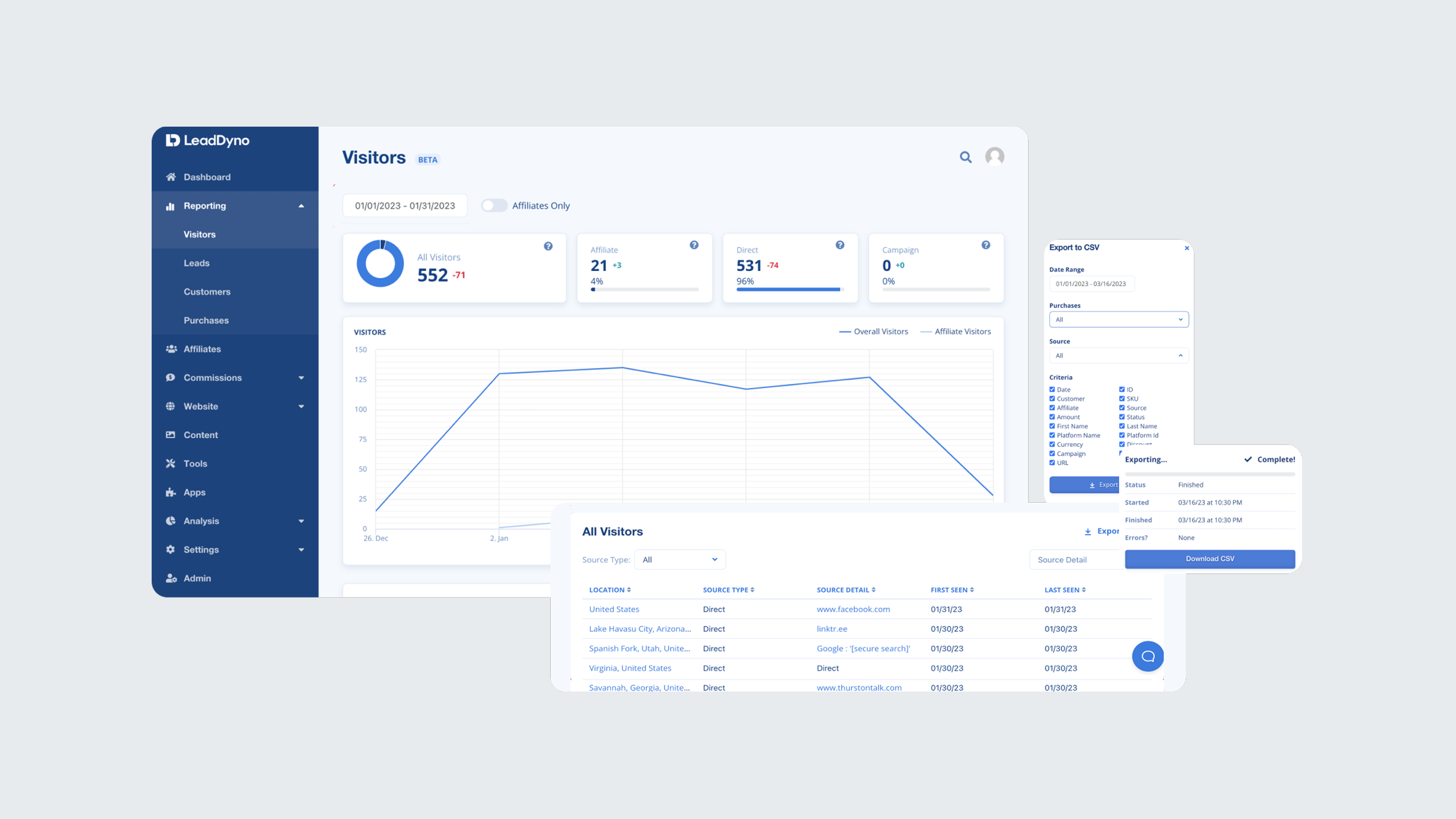
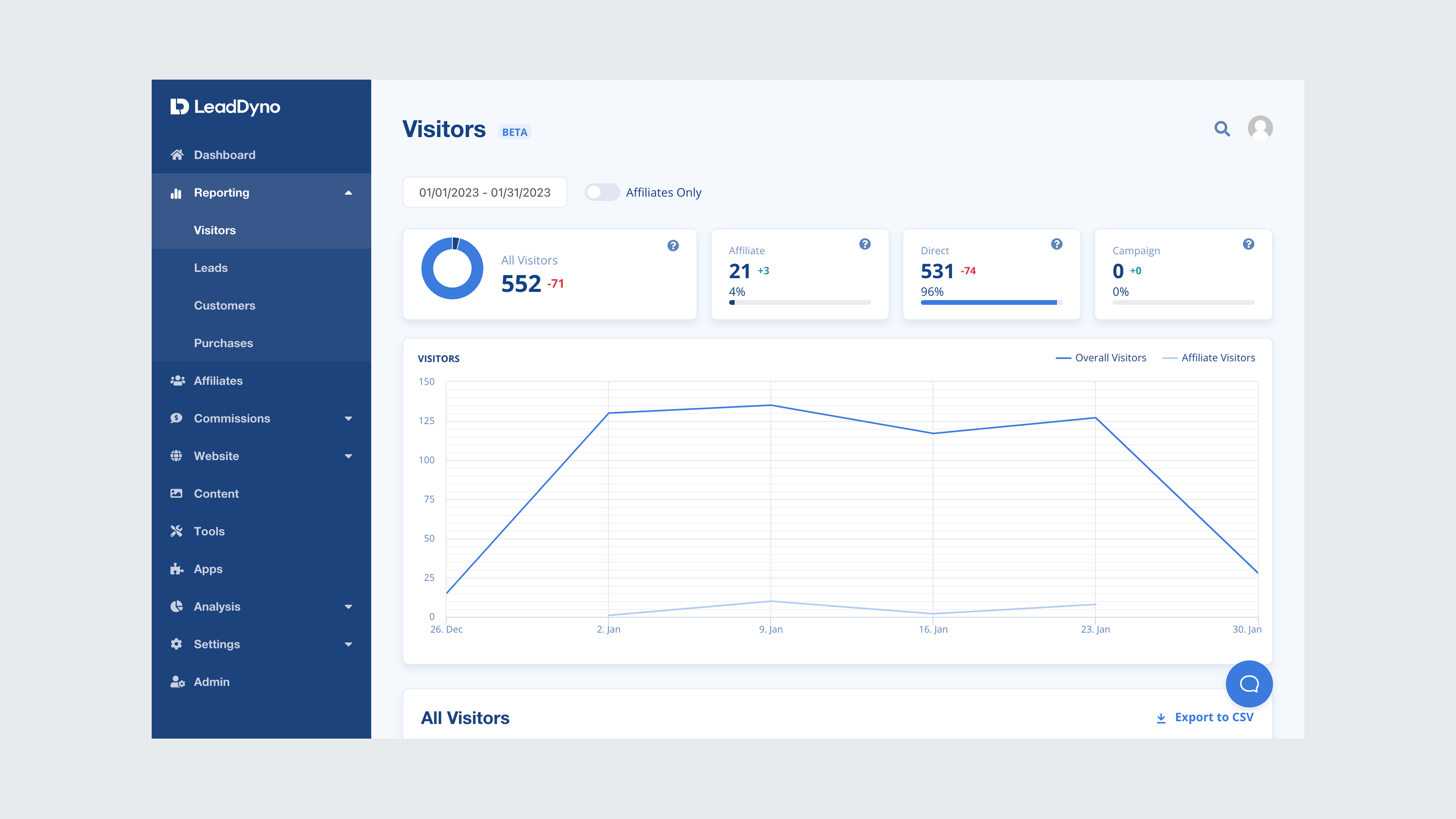
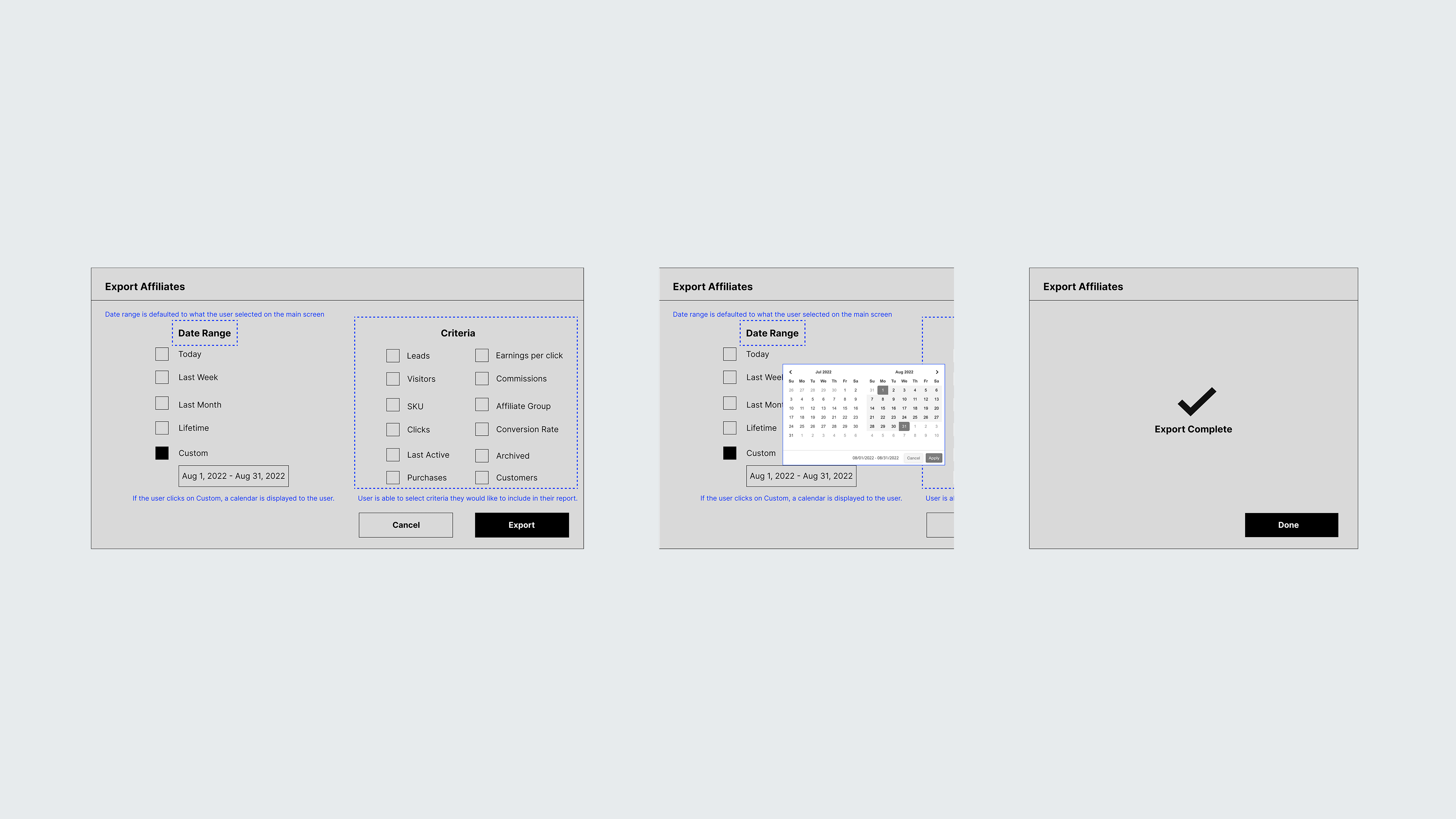
Reporting consisted of various screens; visitors, leads, customers, purchases, commissions, and affiliates. Rather than bundling them as one large update, we opted for a phased approach over the next several months. In order to introduce the updates to users, I worked closely with the PM and growth team to design comprehensive communication releases to users as well as design a tool-tip walkthrough for users that see the updated designs for the first time.
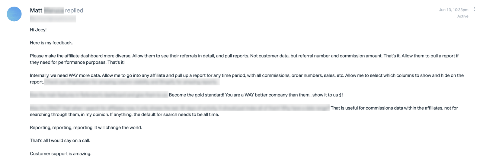
We knew the risk of forgoing usability tests, and focused on functionality expecting corner cases to surface. We wanted to set the expectation for our users that it would not be a perfect release, so we branded the redesigned screens as beta to help ease the transition. I set up an in-app survey using a tool called Refiner to solicit feedback through in-app surveys and encouraged users to contact the team about any bugs or issues. All of this feedback was stored in a research file for iterating.
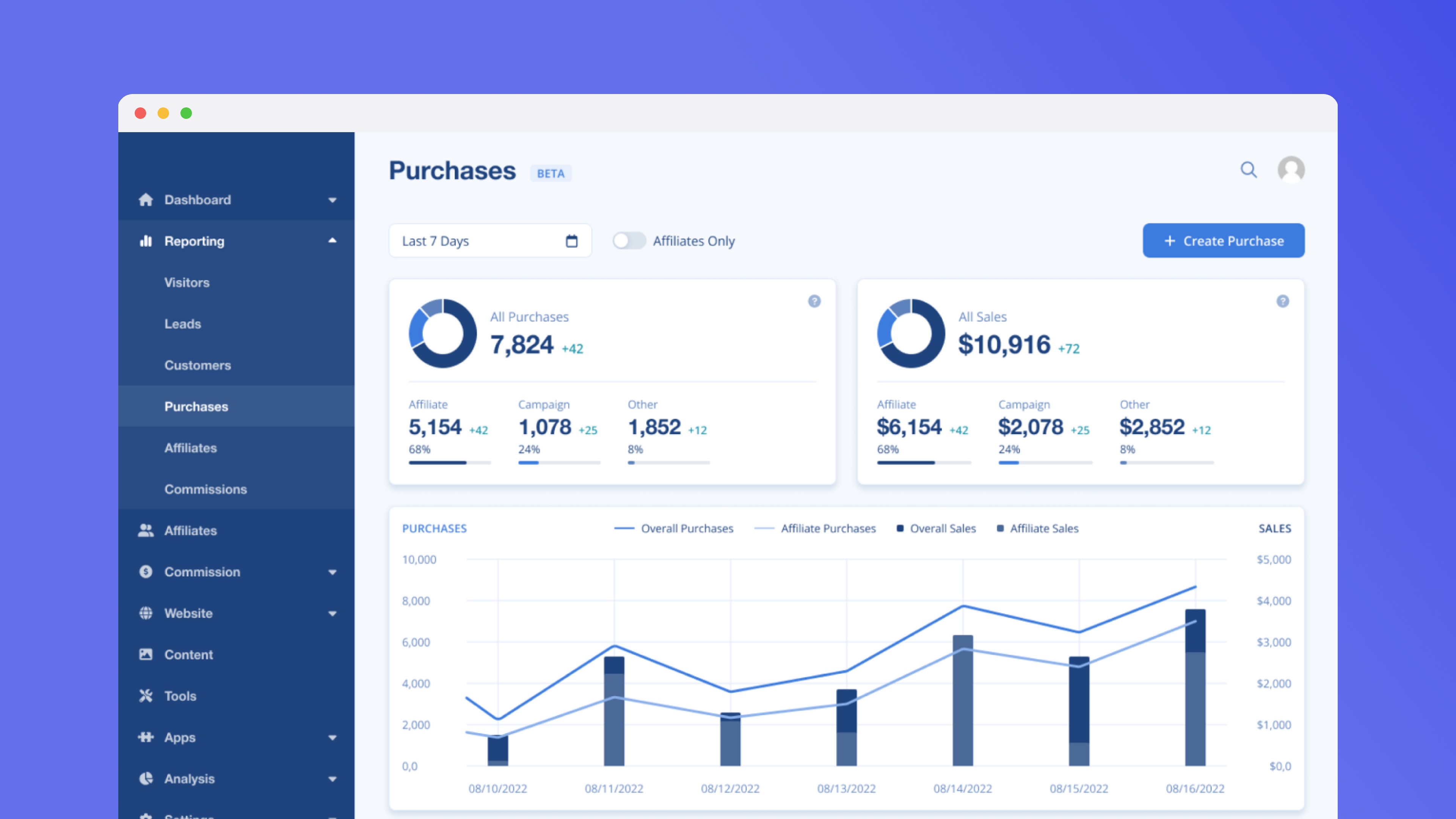
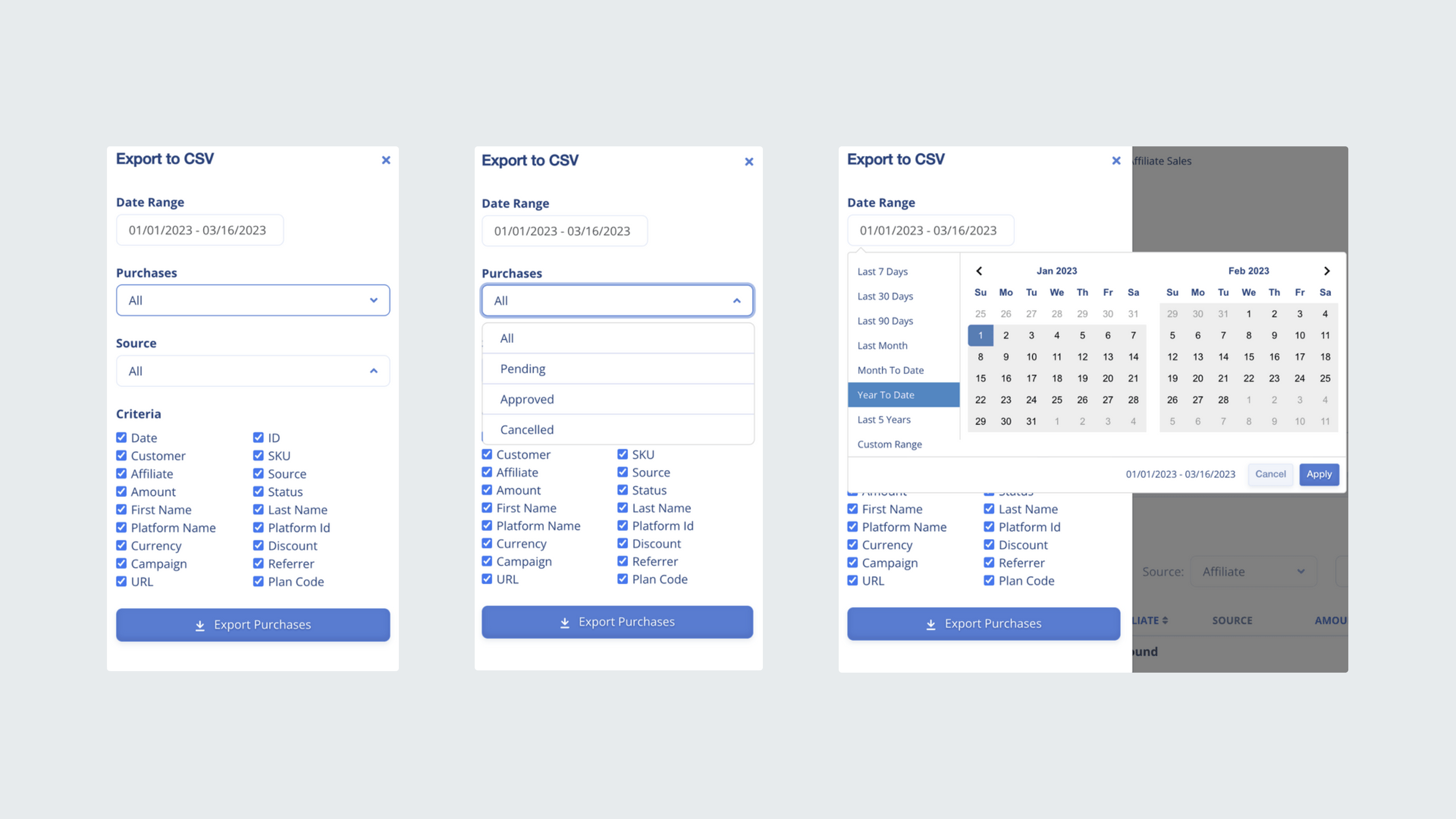
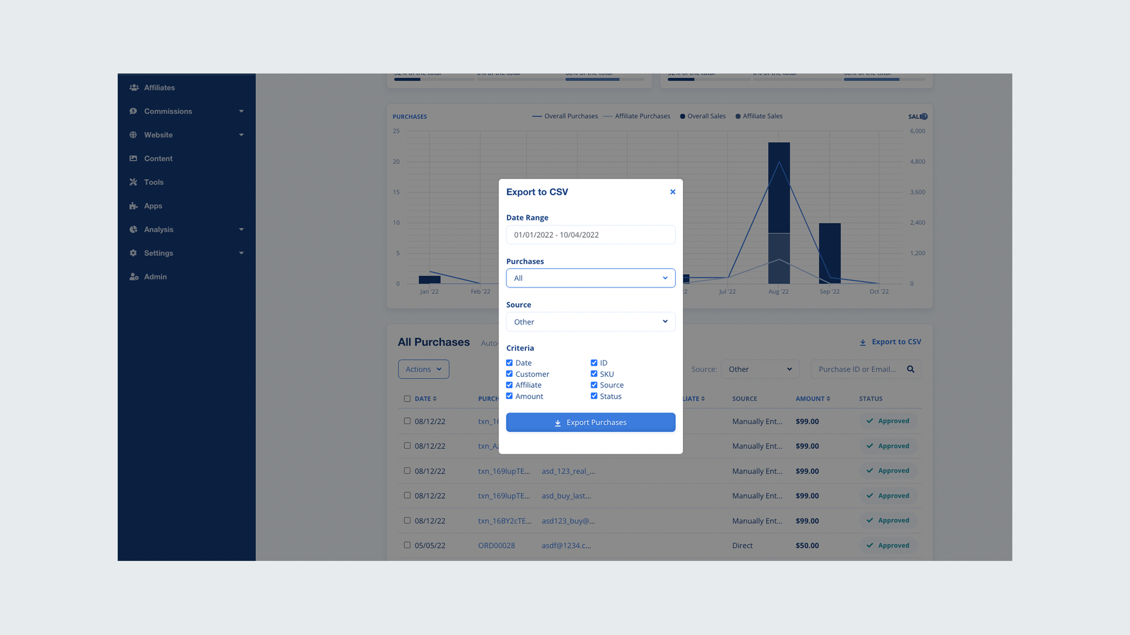
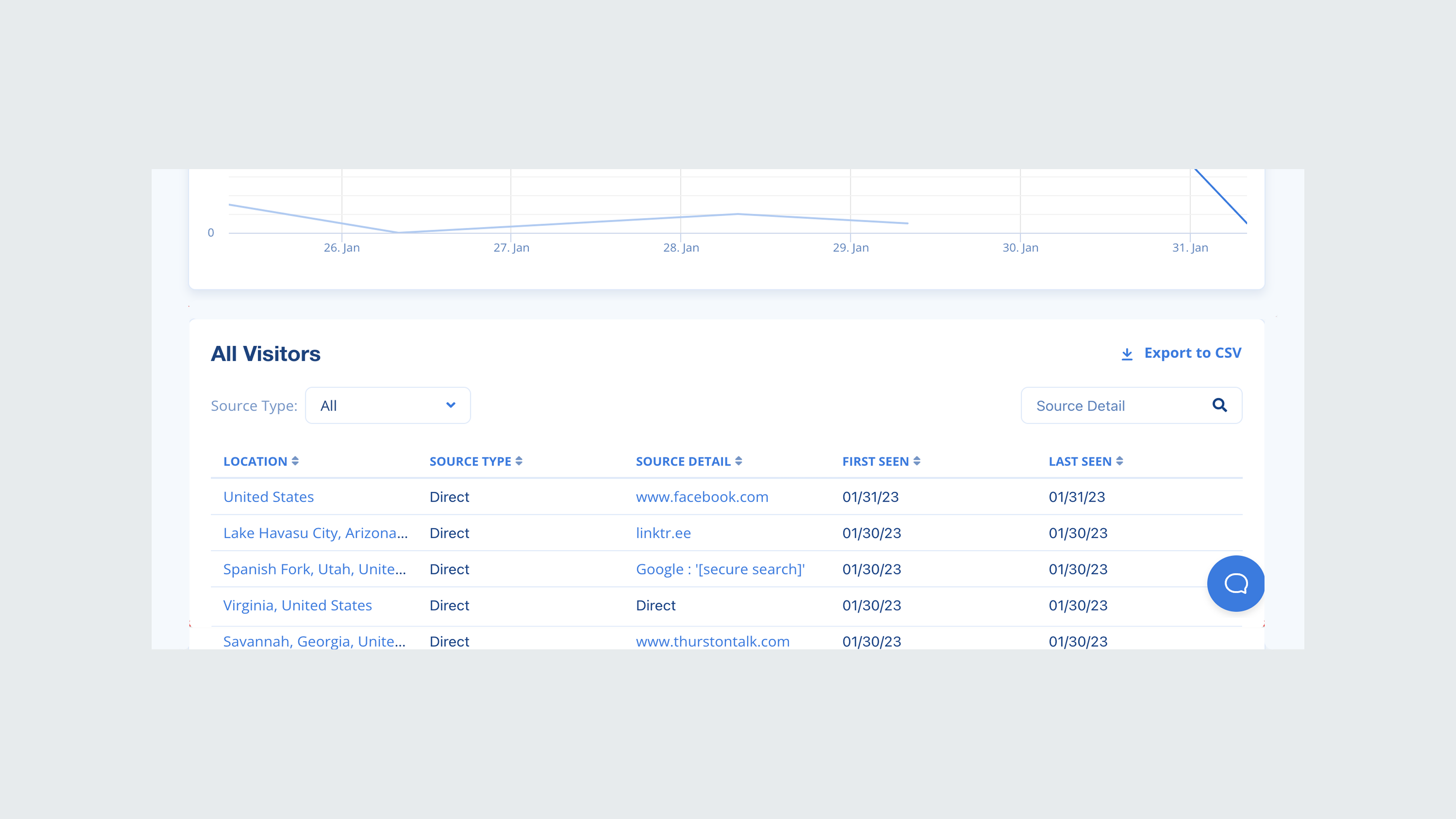
Provided a comprehensive dashboard that displays both overall purchases and affiliate-specific transactions, enabling managers to quickly gauge performance at a glance. The solution also includes purchase attribution in a table format, allowing managers to filter or export data as needed for a detailed evaluation of individual affiliates.
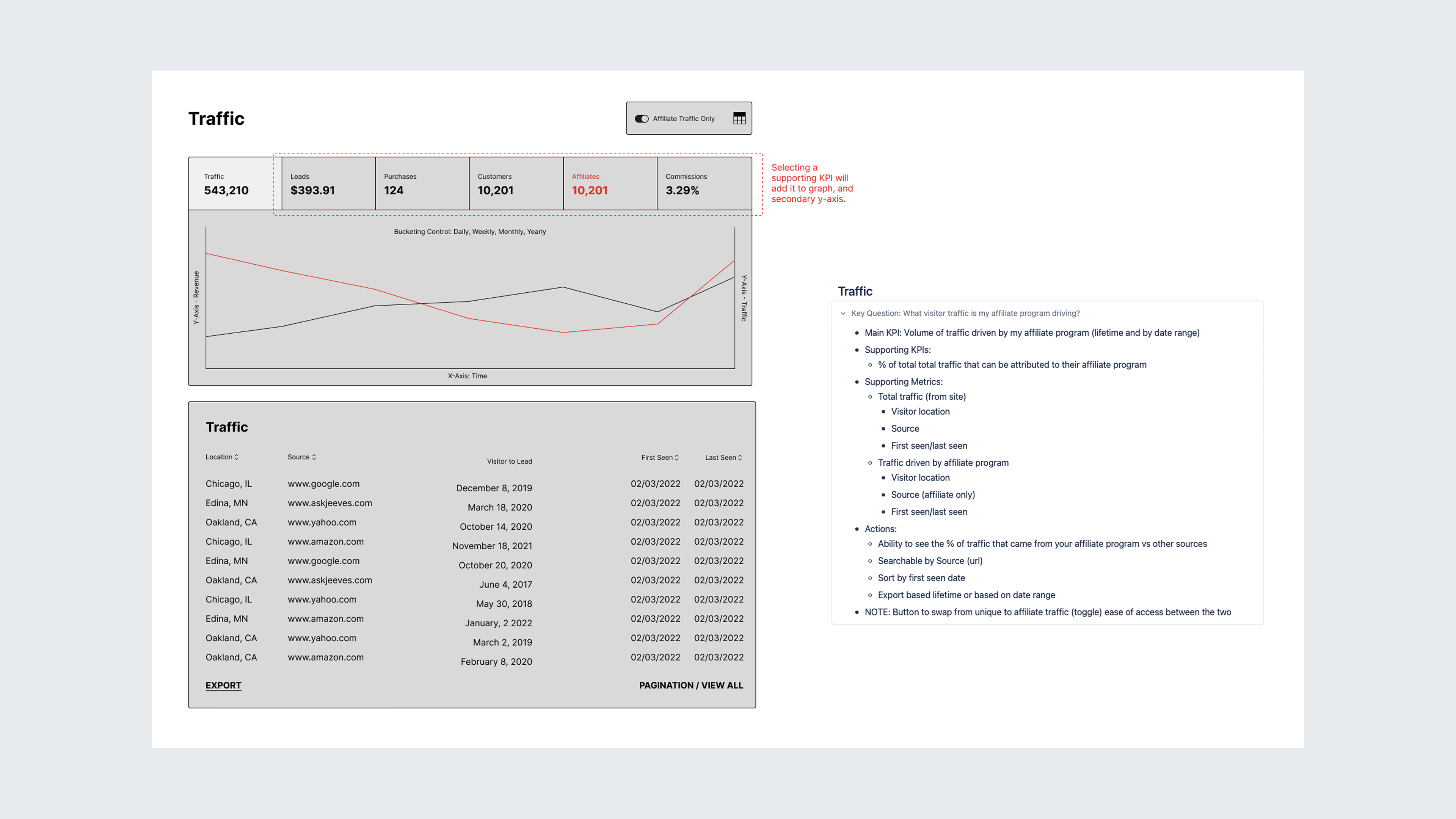
I began by combing through help desk tickets to identify users who had a ticket history related to data or reporting. This method helped streamline my recruitment process for the interviews and essentially screen for potential participants to reach out to about research initiatives.
Due to time constraints, I wasn't able to test prototypes with users. If I had to go back, I would prioritize another round of testing prior to developer handoff. I was able to gain feedback about our early high-fidelity designs from users we had previously interviewed which garnered positive feedback and continued to work with the PM to conduct flash interviews with users for our design concepts.
Reporting consisted of various screens; visitors, leads, customers, purchases, commissions, and affiliates. Rather than bundling them as one large update, we opted for a phased approach over the next several months. In order to introduce the updates to users, I worked closely with the PM and growth team to design comprehensive communication releases to users as well as design a tool-tip walkthrough for users that see the updated designs for the first time.
We knew the risk of forgoing usability tests, and focused on functionality expecting corner cases to surface. We wanted to set the expectation for our users that it would not be a perfect release, so we branded the redesigned screens as beta to help ease the transition. I set up an in-app survey using a tool called Refiner to solicit feedback through in-app surveys and encouraged users to contact the team about any bugs or issues. All of this feedback was stored in a research file for iterating.
This page is intentionally lean. Grab some time on my calendar and I'll walk you through everything behind it: the constraints, the pivots, and what I'd do differently.