LeadDyno
Reducing churn through data visualization.
-11%
82%
+17%
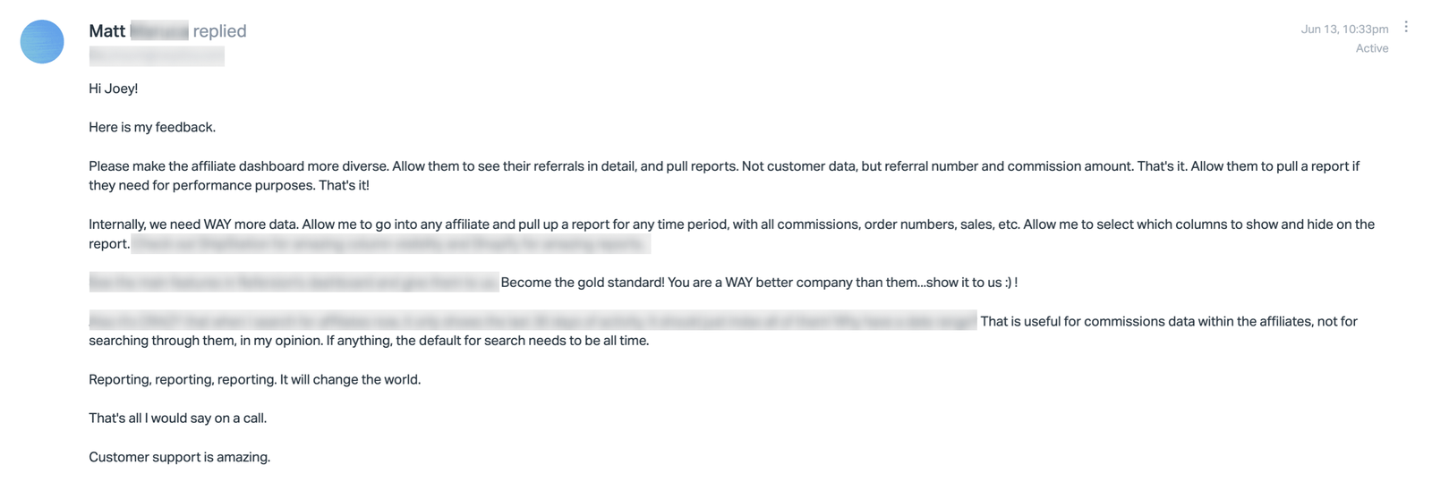
"The feedback on this initiative has been amazing – customers say it’s everything they need."
– Brooke Hahn, CEO
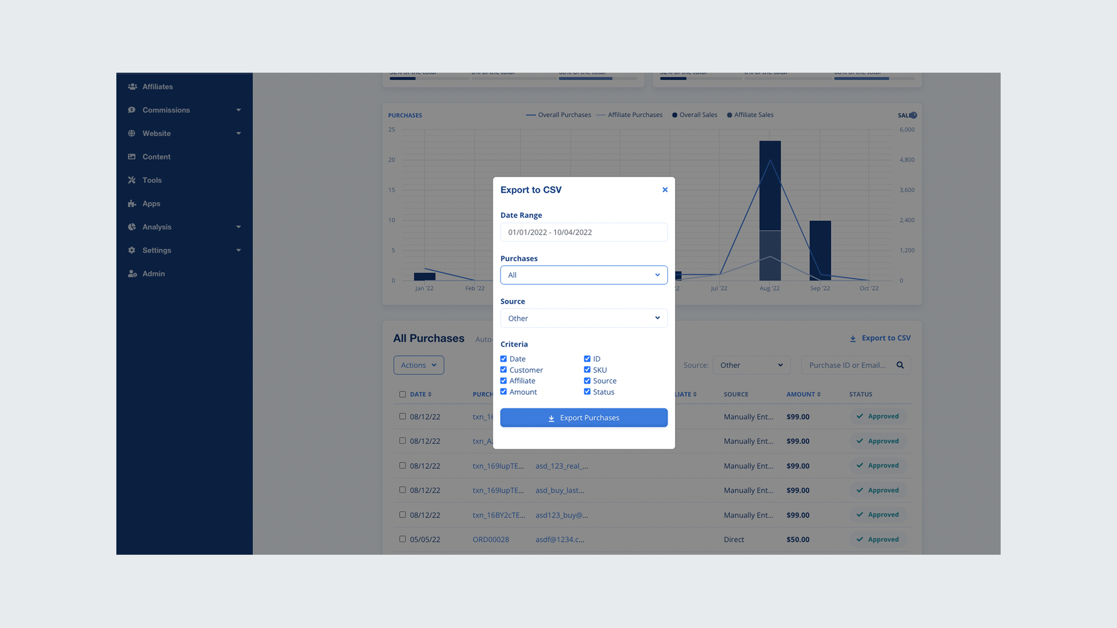
Churn was slowly increasing month over month, with users citing frustration over their inability to drill into granular program details like affiliate performance and purchase data. Even more, generating a data export required users to submit help desk tickets which impacted the support team with busy work.
“The data I have now doesn’t tell me much, I have no idea who or how my affiliates are doing. It would be great to be able to see exactly how much of my sales is coming from them.”
– User Interviewee
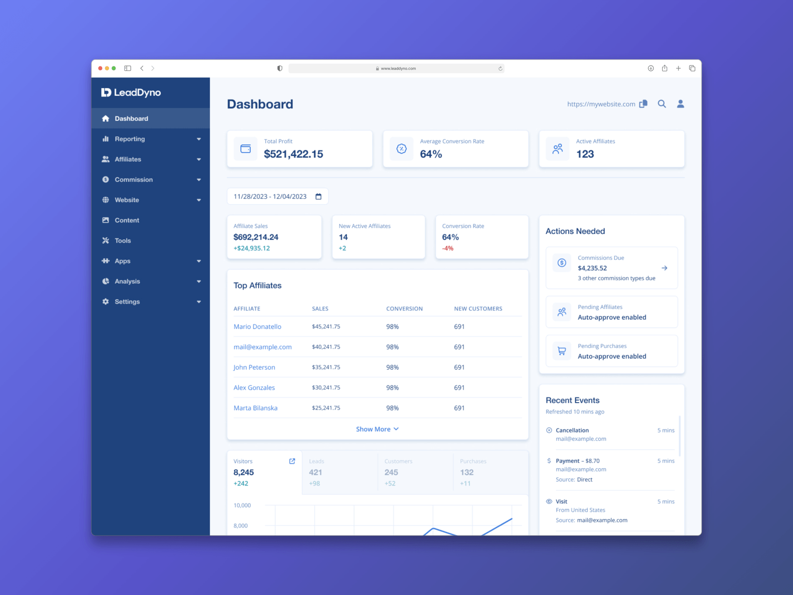
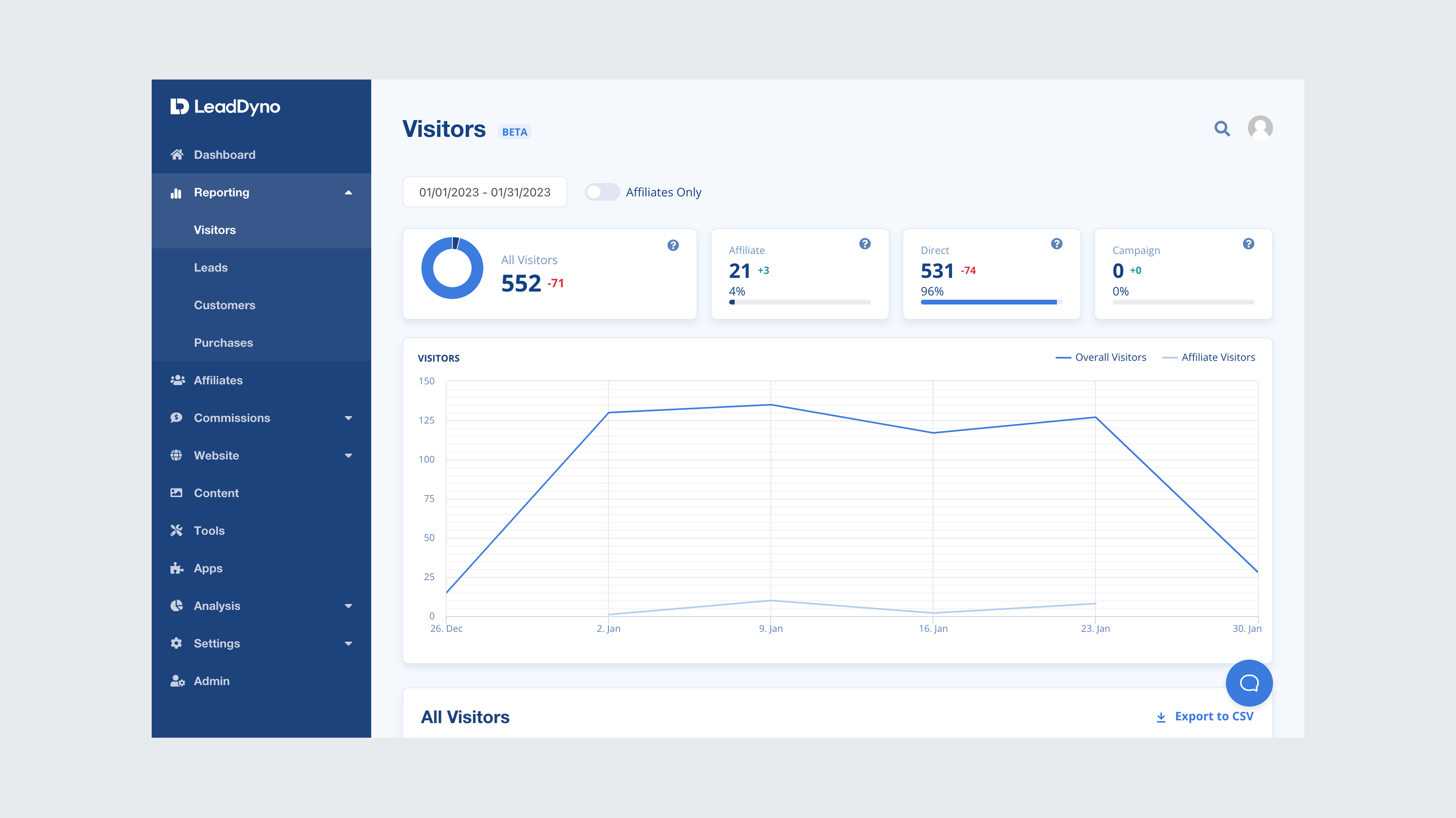
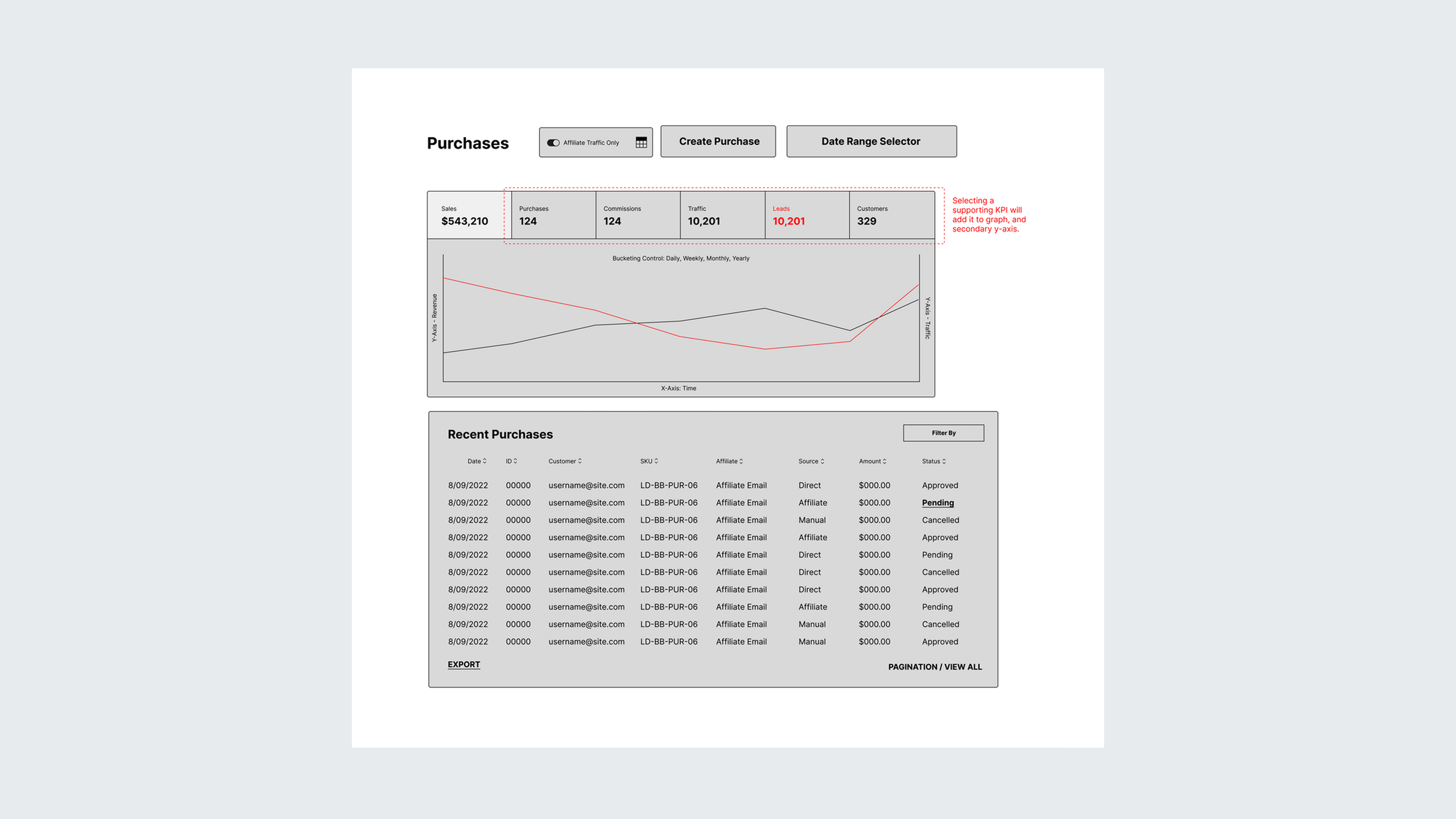
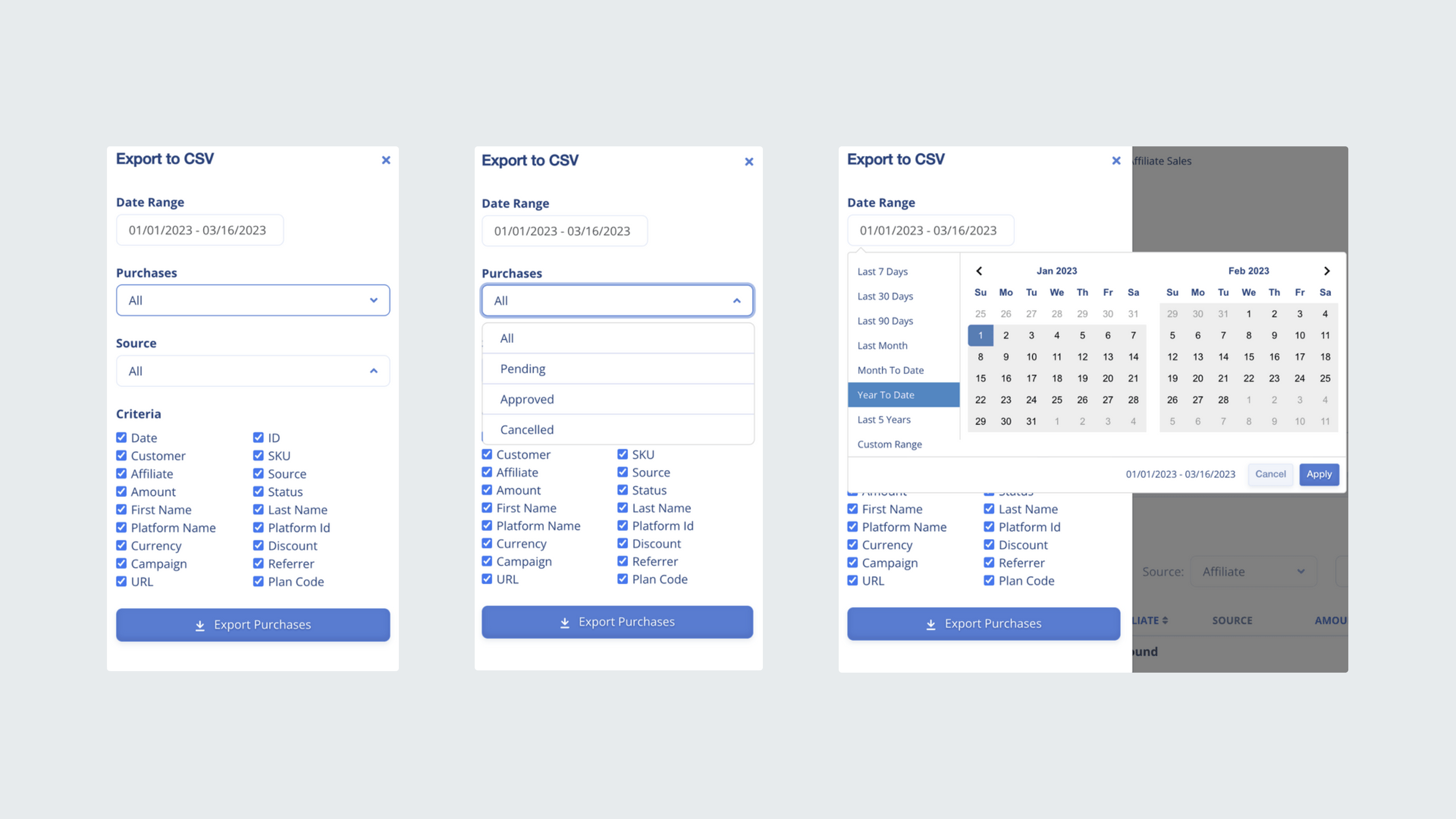
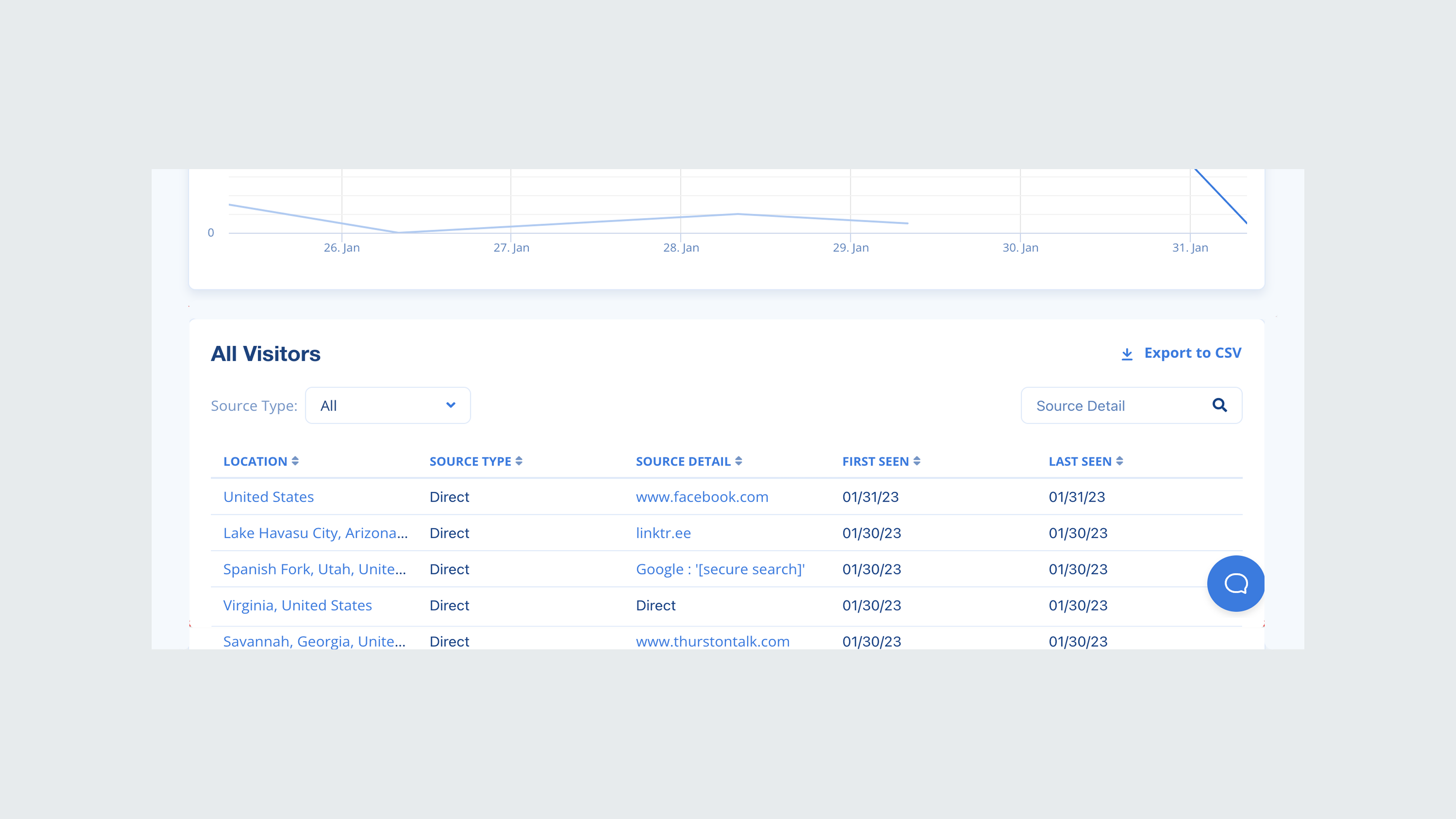
Provided a comprehensive dashboard that displays both overall purchases and affiliate-specific transactions, enabling managers to quickly gauge performance at a glance. The solution also includes purchase attribution in a table format, allowing managers to filter or export data as needed for a detailed evaluation of individual affiliates.
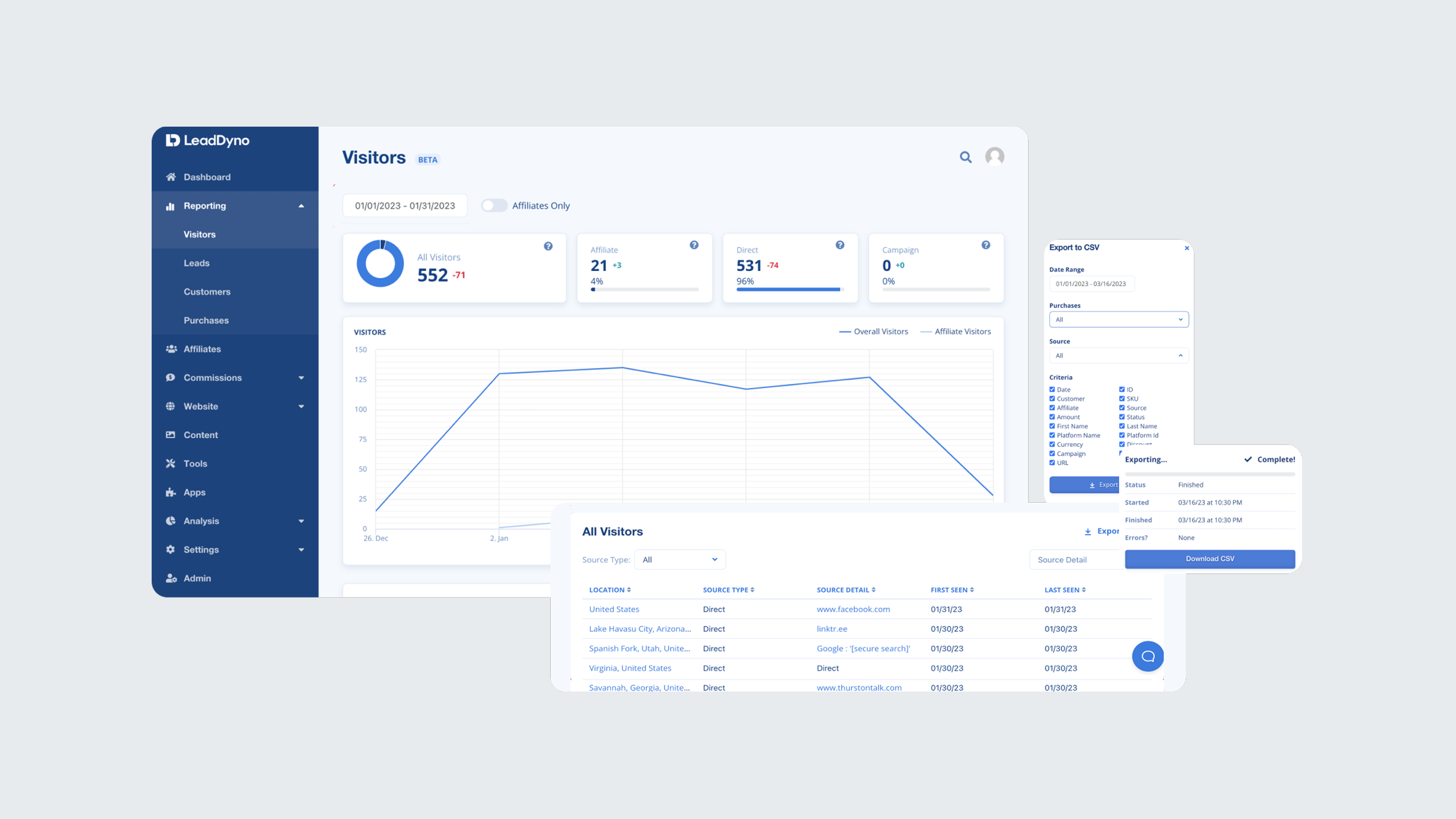
This empowered managers to quickly identify trends and discrepancies in both overall and affiliate-specific performance. By enabling purchase attribution and enhanced data filtering and export capabilities, managers gained deeper insights, allowing for more informed decision-making and improved strategic planning.
I began by combing through help desk tickets to identify users who had a ticket history related to data or reporting. This method helped streamline my recruitment process for the interviews and essentially screen for potential participants to reach out to about research initiatives.
+300
8/10
1
87%
By centering the design process around these essential questions, we ensured that the solutions were not only functional but also highly relevant to the users' needs. After we established feasibility and viability, I worked closely with the UI designer, creating and refining components and translating the wireframes into high-fidelity mocks.
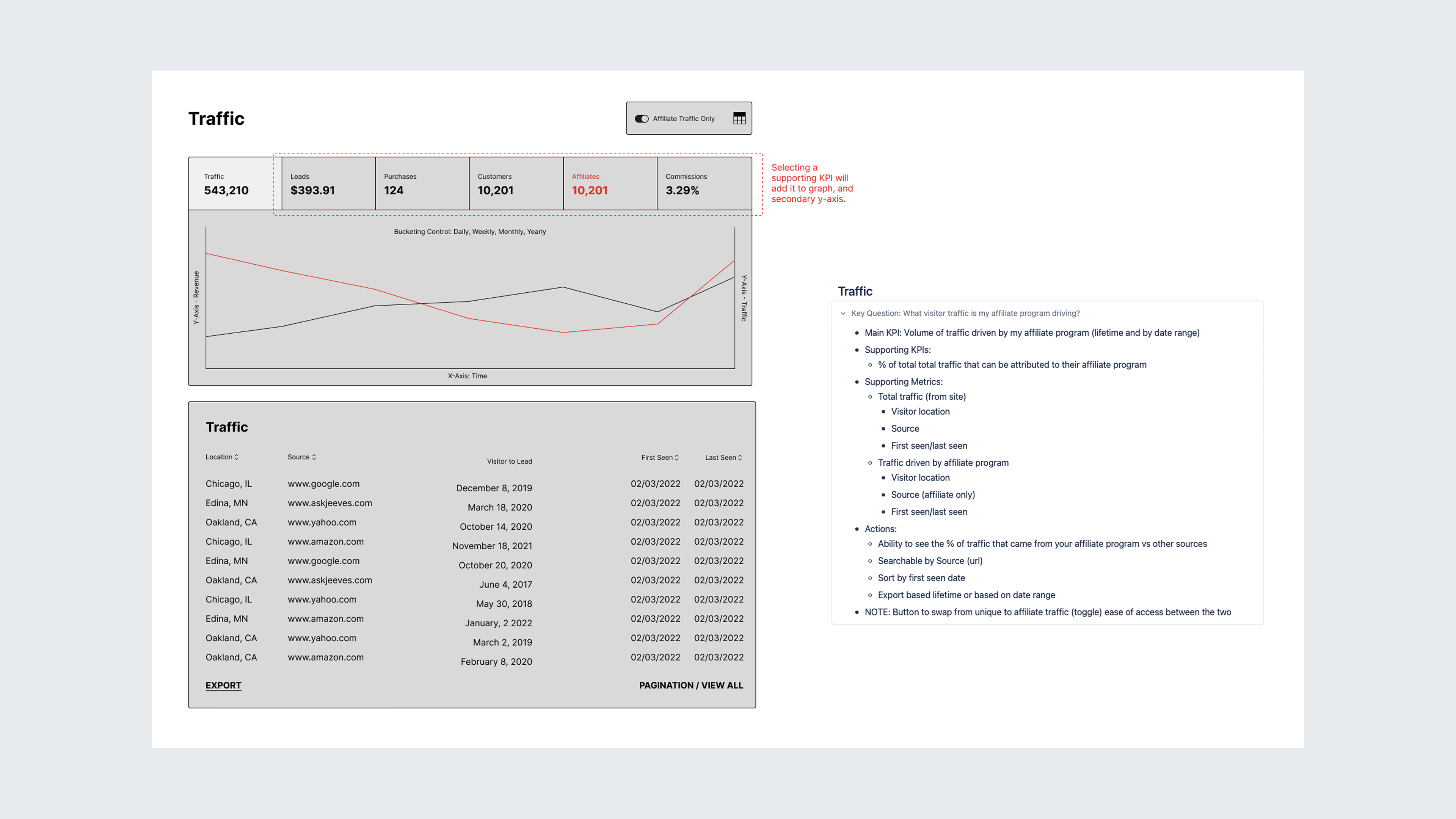
In shaping the solutions, I began by closely examining the research insights to identify the core frustrations users faced with the current reporting system. Developing key questions for each reporting section, focusing on what users most needed to know to achieve their goals.
By centering the design process around these essential questions, we ensured that the solutions were not only functional but also highly relevant to the users' needs. After we established feasibility and viability, I worked closely with the UI designer, creating and refining components and translating the wireframes into high-fidelity mocks.
Due to time constraints, I wasn't able to test prototypes with users. If I had to go back, I would prioritize another round of testing prior to developer handoff. I was able to gain feedback about our early high-fidelity designs from users we had previously interviewed which garnered positive feedback and continued to work with the PM to conduct flash interviews with users for our design concepts.
Reporting consisted of various screens; visitors, leads, customers, purchases, commissions, and affiliates. Rather than bundling them as one large update, we opted for a phased approach over the next several months. In order to introduce the updates to users, I worked closely with the PM and growth team to design comprehensive communication releases to users as well as design a tool-tip walkthrough for users that see the updated designs for the first time.
We knew the risk of forgoing usability tests, and focused on functionality expecting corner cases to surface. We wanted to set the expectation for our users that it would not be a perfect release, so we branded the redesigned screens as beta to help ease the transition. I set up an in-app survey using a tool called Refiner to solicit feedback through in-app surveys and encouraged users to contact the team about any bugs or issues. All of this feedback was stored in a research file for iterating.