Building a design system to support 2M+ visitors.
A blueprint for design and development.
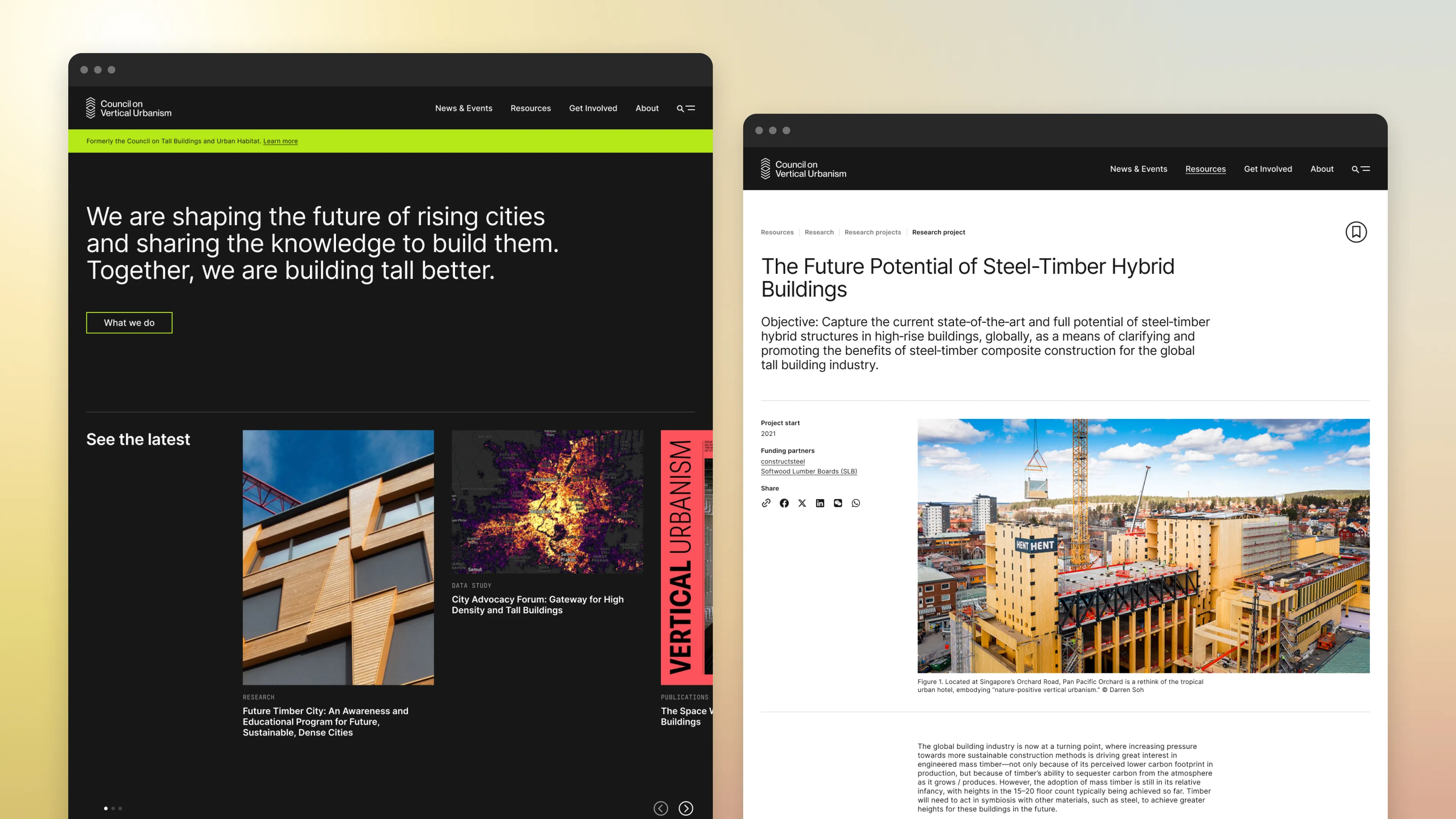
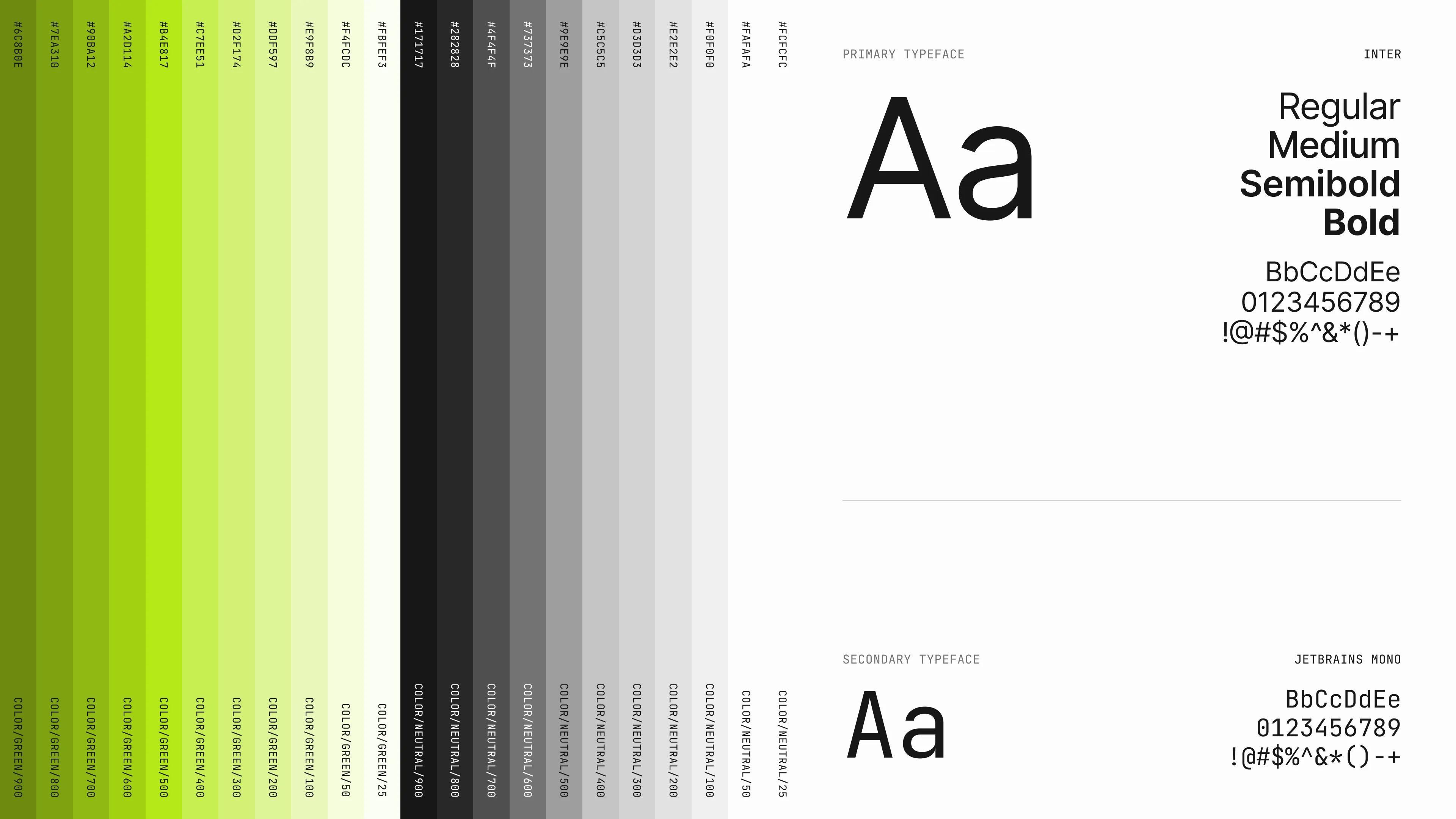
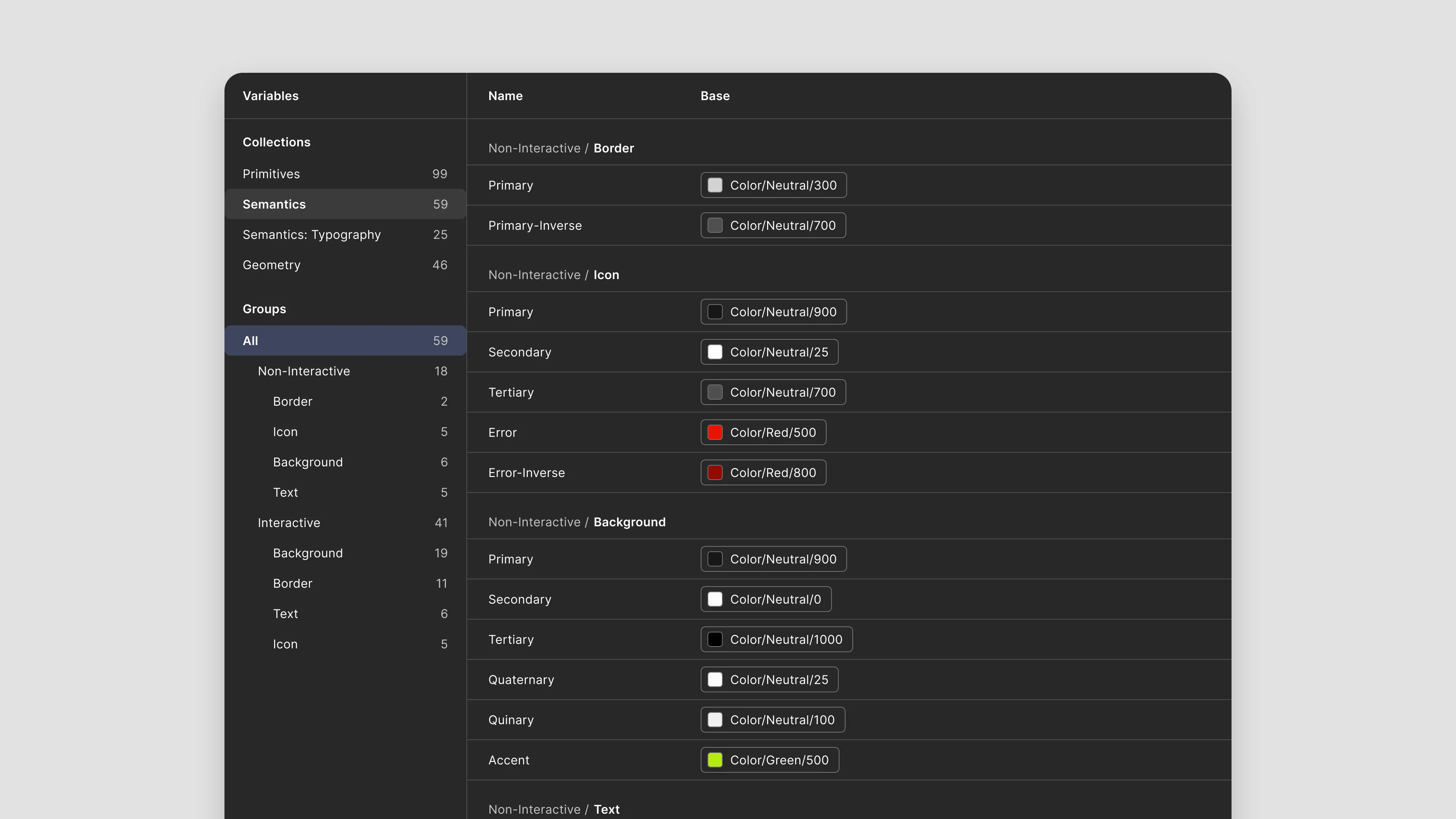
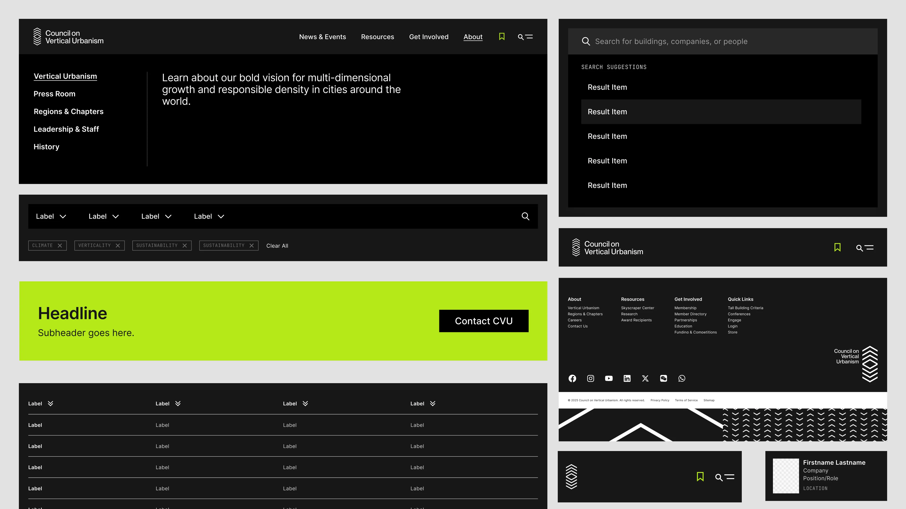
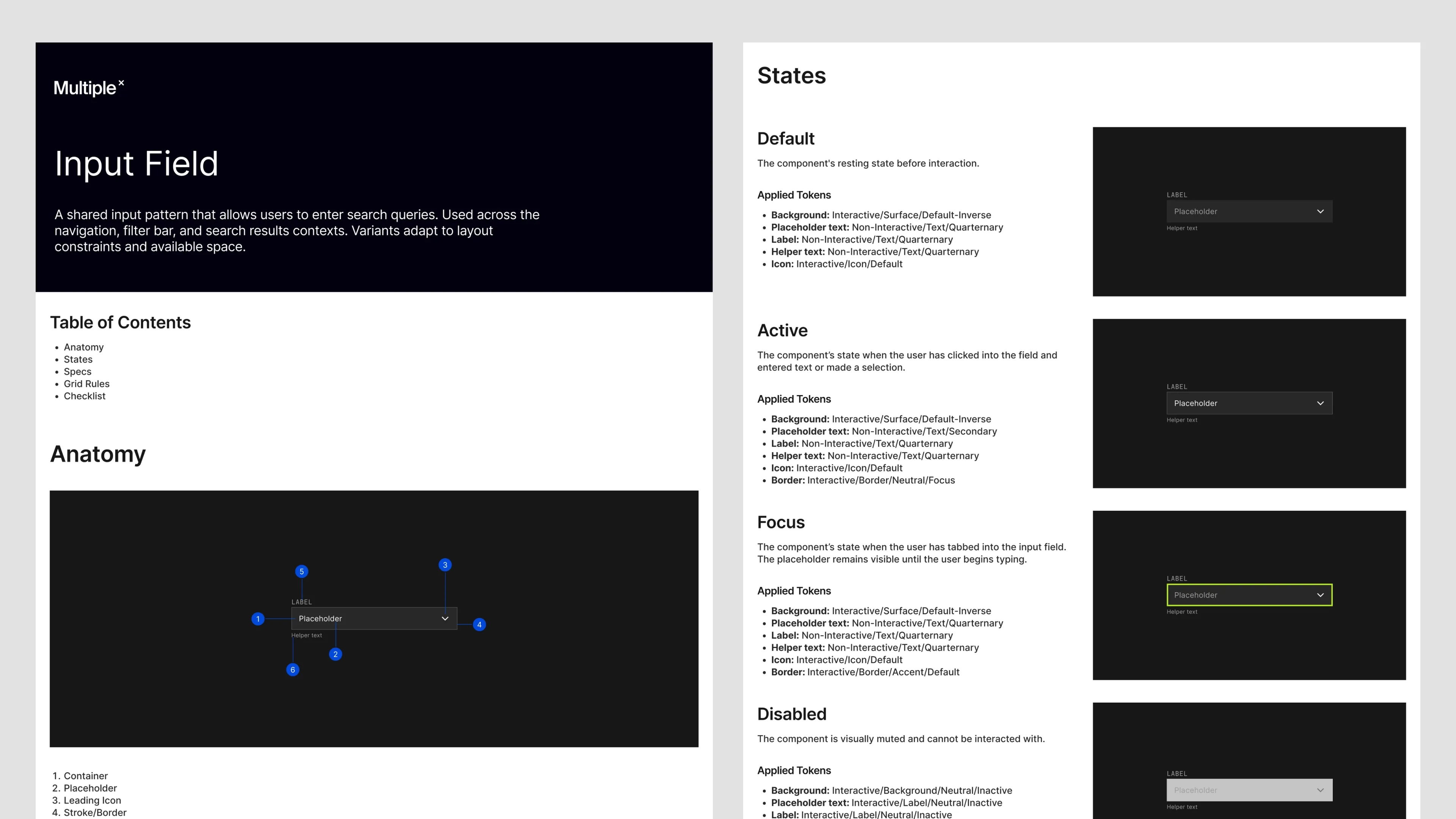
I built the design system in Figma from the ground up: foundations, a token structure, and a component library with documented properties and interaction states. I checked contrast and focus order as I went, and the developers built the site from it.
What the early work made possible.
About a month before launch, the scope of client needs changed, and they needed more ability to build pages than originally anticipated. We designed template pages for the News & Events posts, but it wasn't enough for them to build bespoke pages.
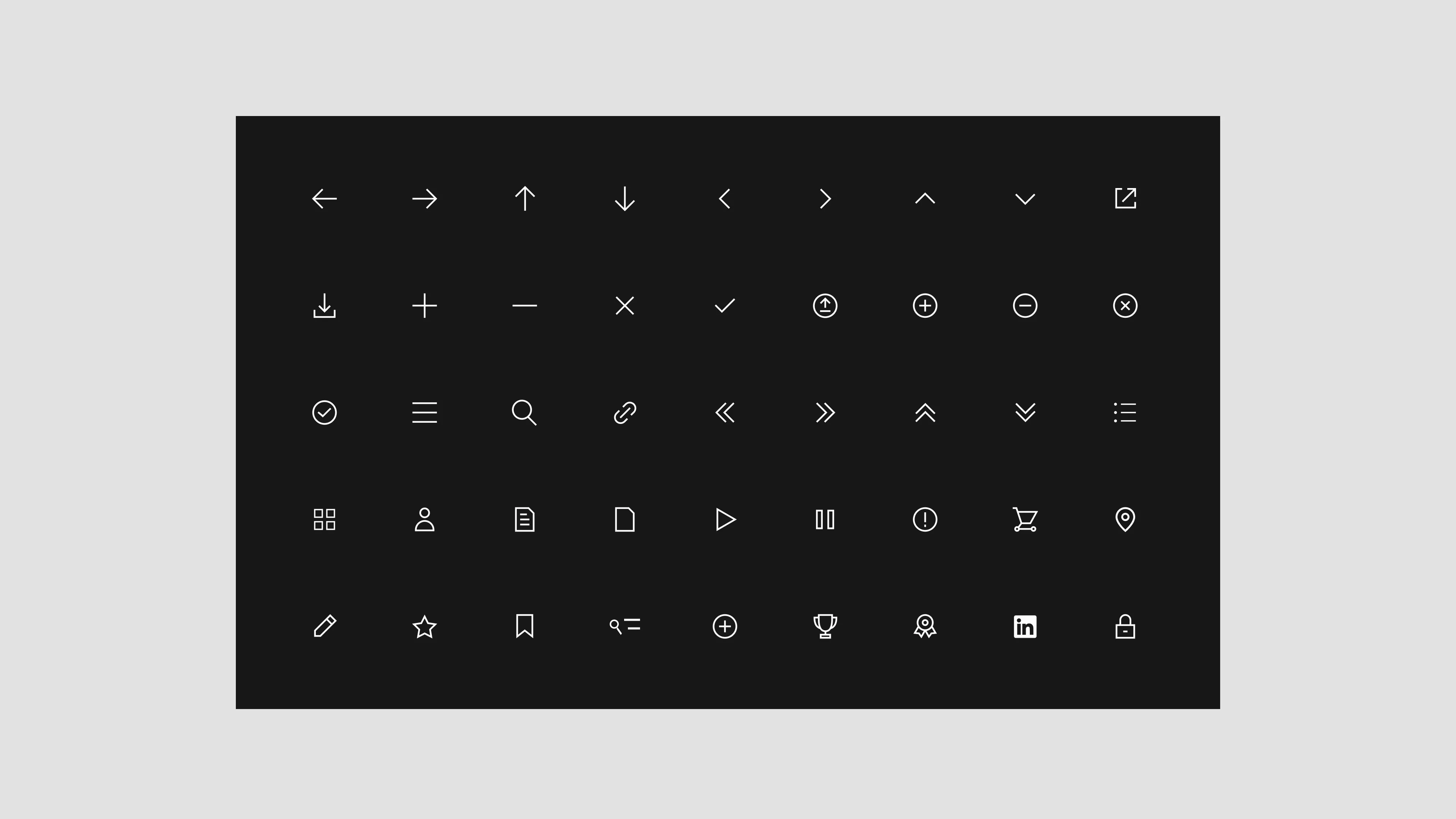
I worked with our developers to select patterns and build them into 35 editable components in the WordPress page builder. The full Figma library has about 70 component sets and 190 variables.
“If our components hadn’t been organized so intentionally, this shift would have been far more time-consuming. The work we did early on clearly paid off.”- Front end developer, project post mortem
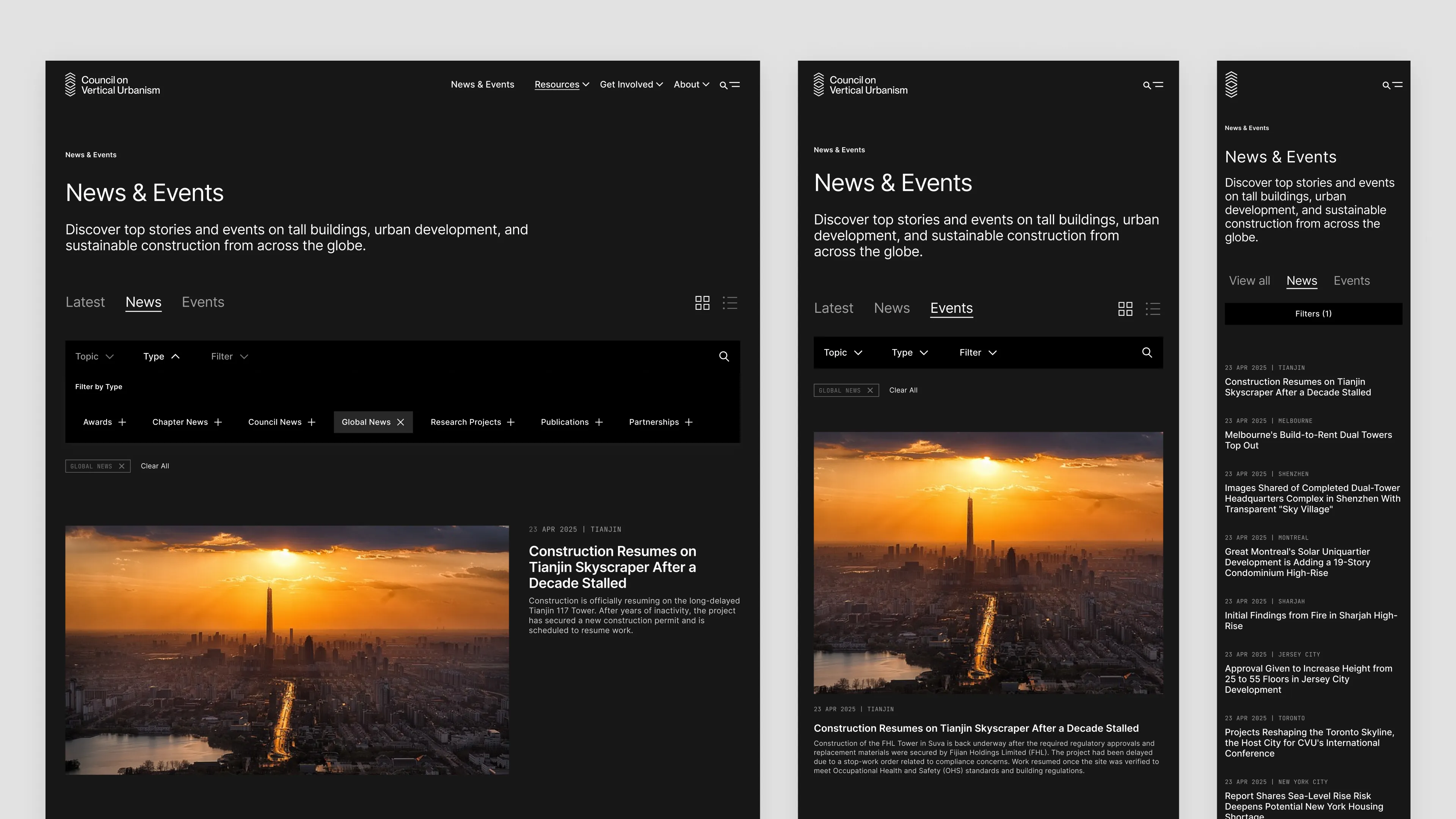
The site launched with 40 secondary landing pages and 10 filterable post types. Since then, it has had about 2 million visitors from around the world.
How I set the system up.
This case study presents the work in stages, but exploration, alignment, and execution were all happening at the same time. Early audit findings shaped token decisions, and those decisions fed back into how we I ran the workshops.
Auditing the legacy site.
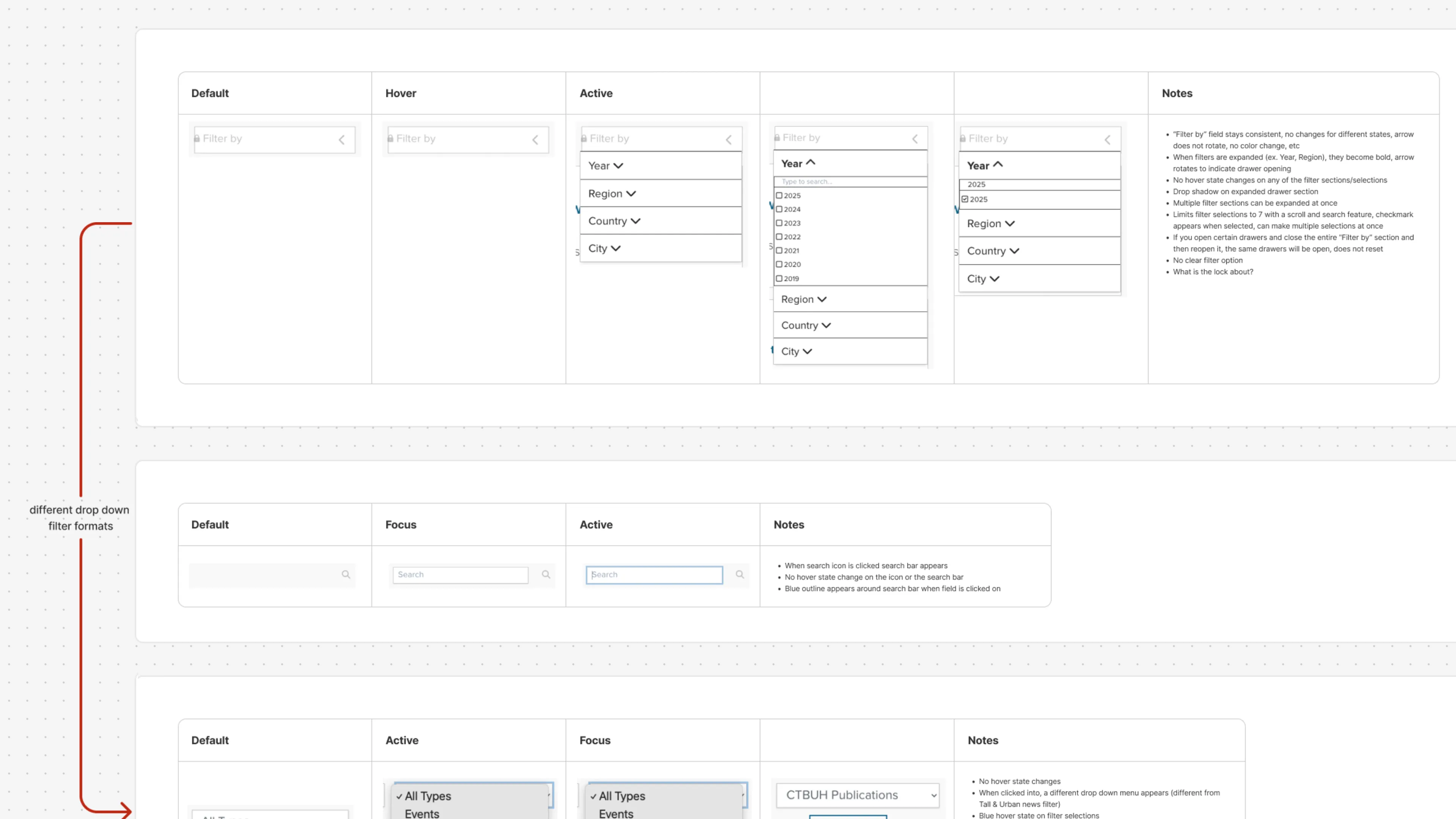
I began with a design audit of the legacy site, identifying usability gaps, inconsistent behaviors, and missed opportunities for component reuse. It turned up inconsistent patterns, dated design, accessibility violations, and keyboard navigation issues.
Agreeing on a shared vocabulary.
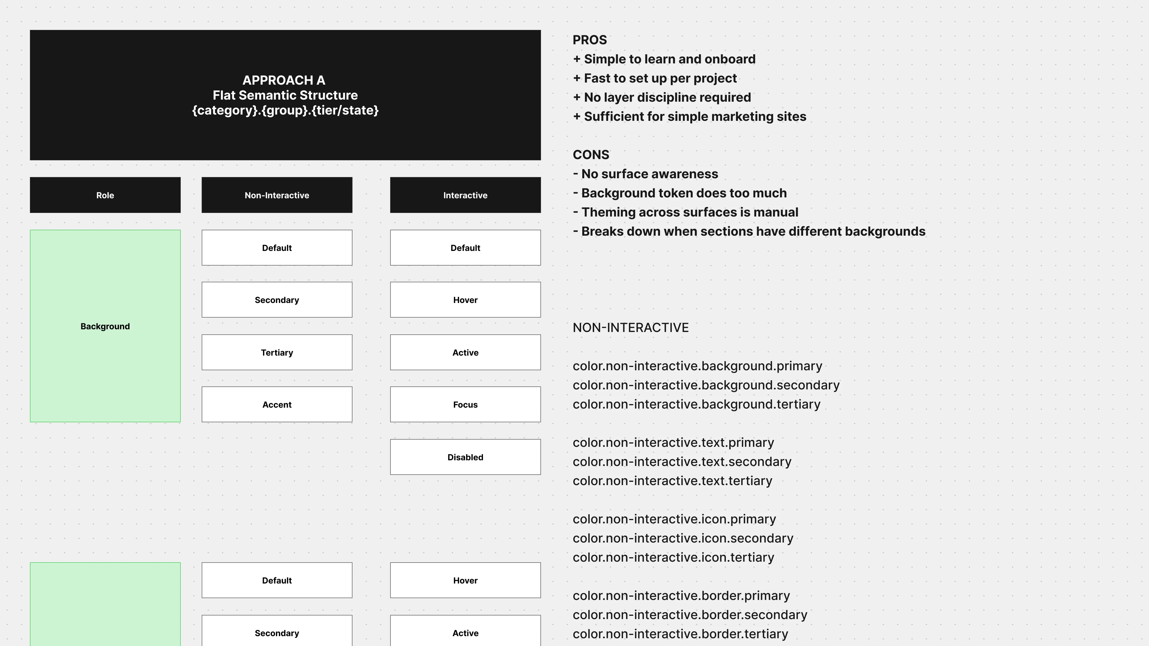
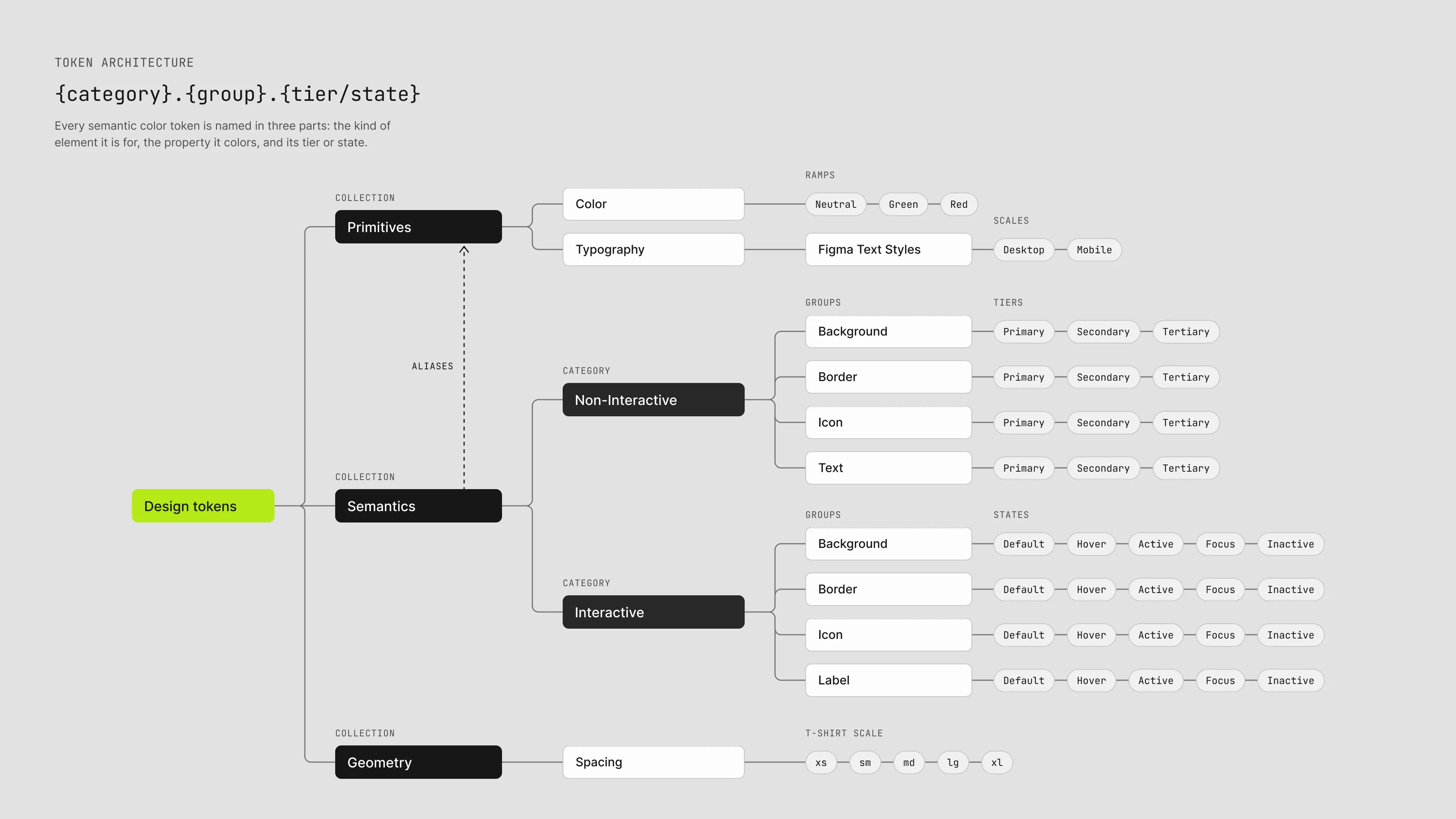
I led token workshops with the design and development teams individually, before bringing them both together. My goal was to define (button, input) from what it does (hover, focus) and how it looks (accent, neutral, error).
Running the sessions separately first surfaced how differently each team talked about the same work. By the time we brought everyone together, the shared language had come from the team and not prescribed to them.
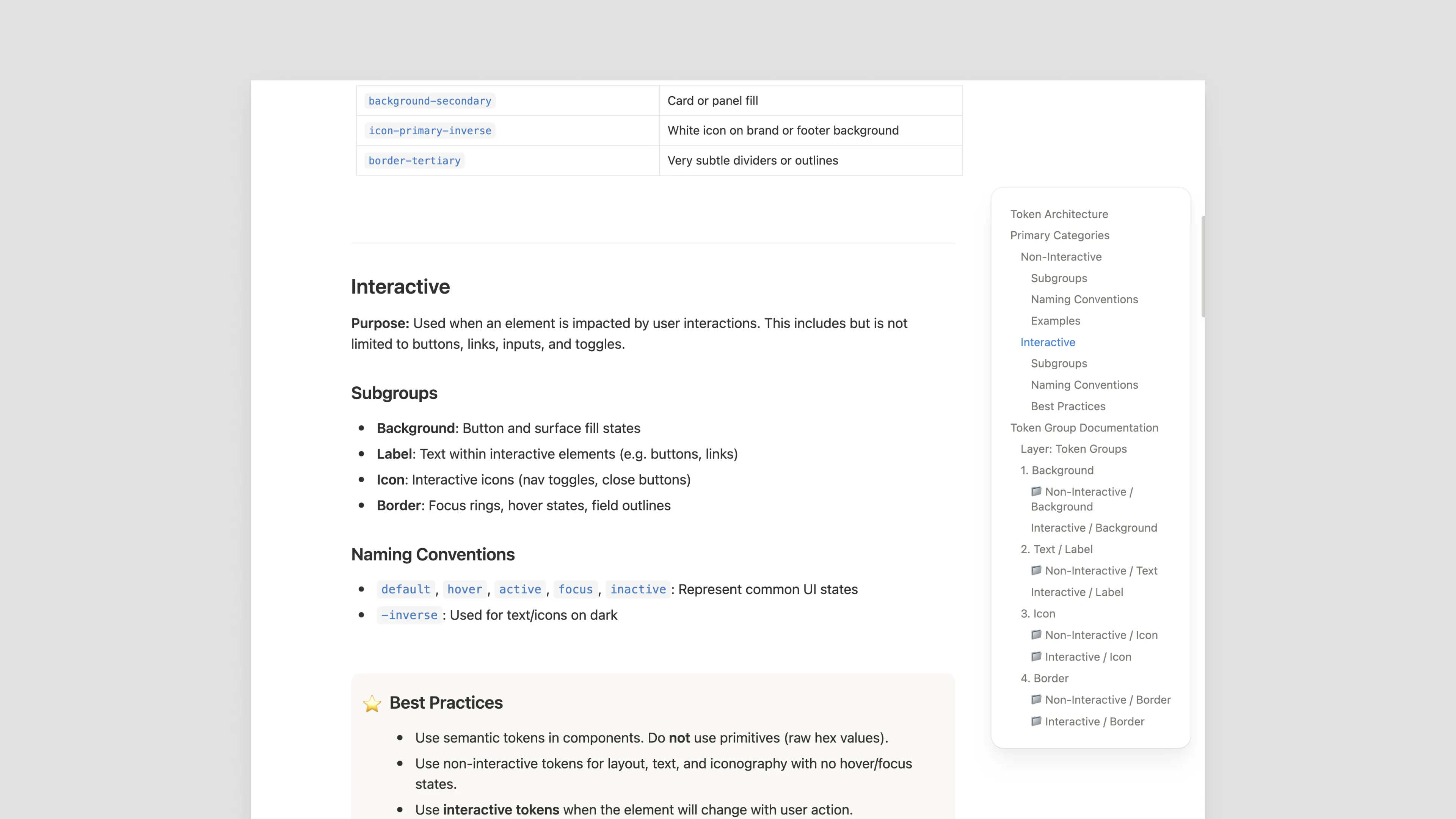
I also documented the token architecture in Notion. A reference the team could use during the project, and that future teammates could pick up.
Choices that shaped the system.
Token architecture
Multiple had never built a site with a design system before, so I pushed for a lean and easy option to pick up quickly. Since this project was for a marketing site, the team agreed on a flat semantic approach that didn’t call for multiple theming options.
Choosing styles over variables
I originally planned to use typography variables, but then chose Figma text styles instead. It was a lot easier for developers to implement and for designers to assign styles and both preferred this approach.
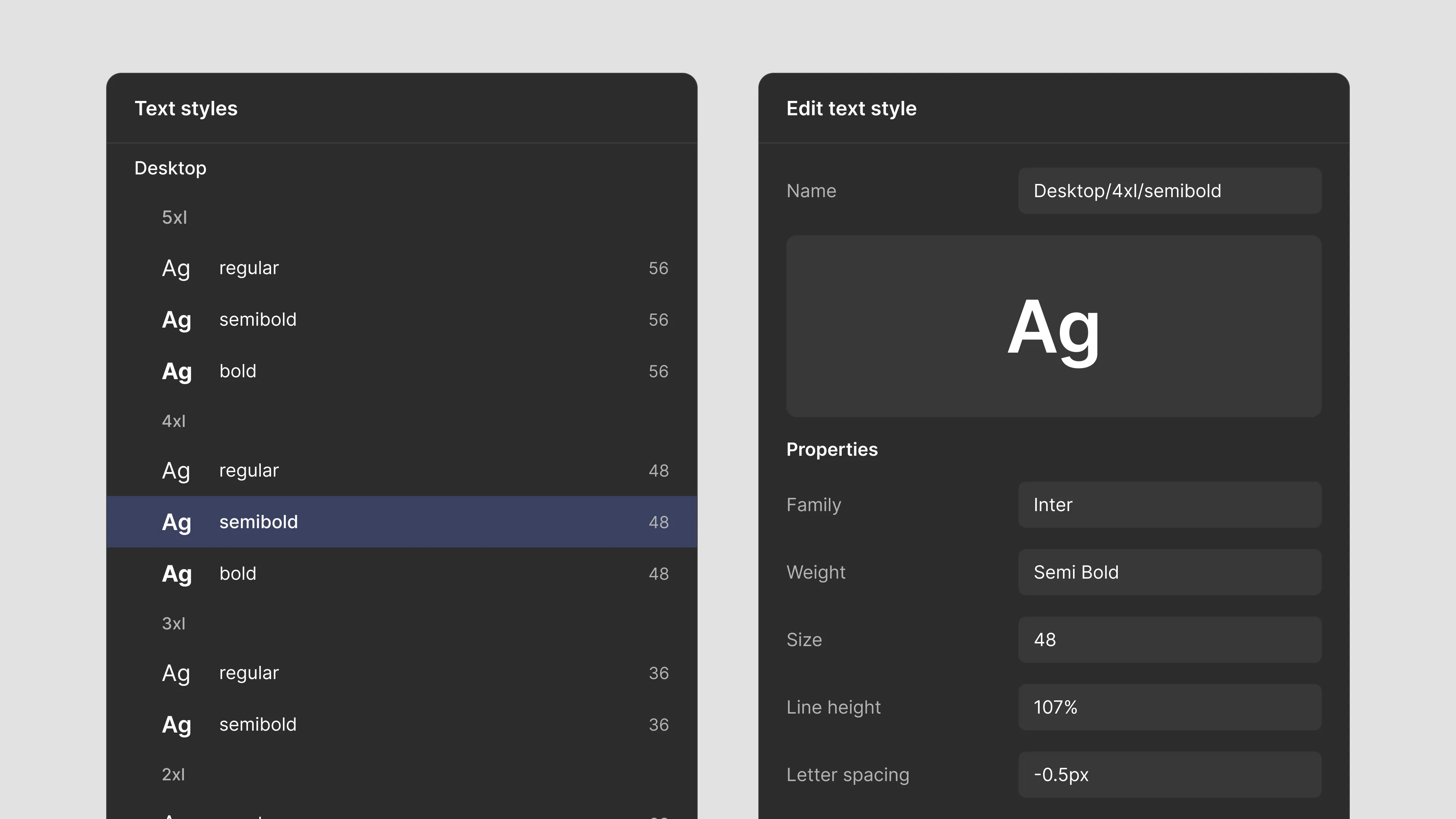
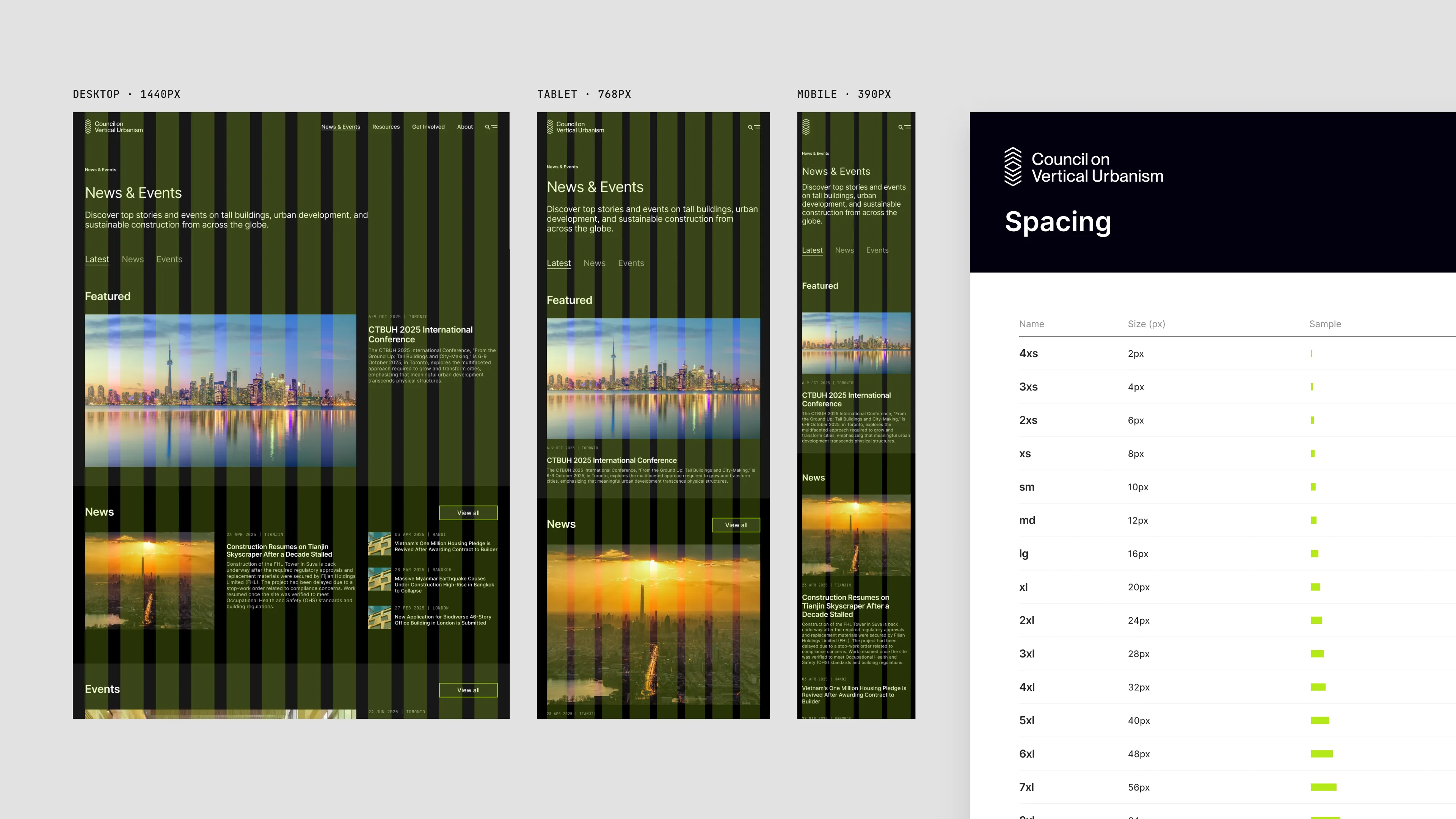
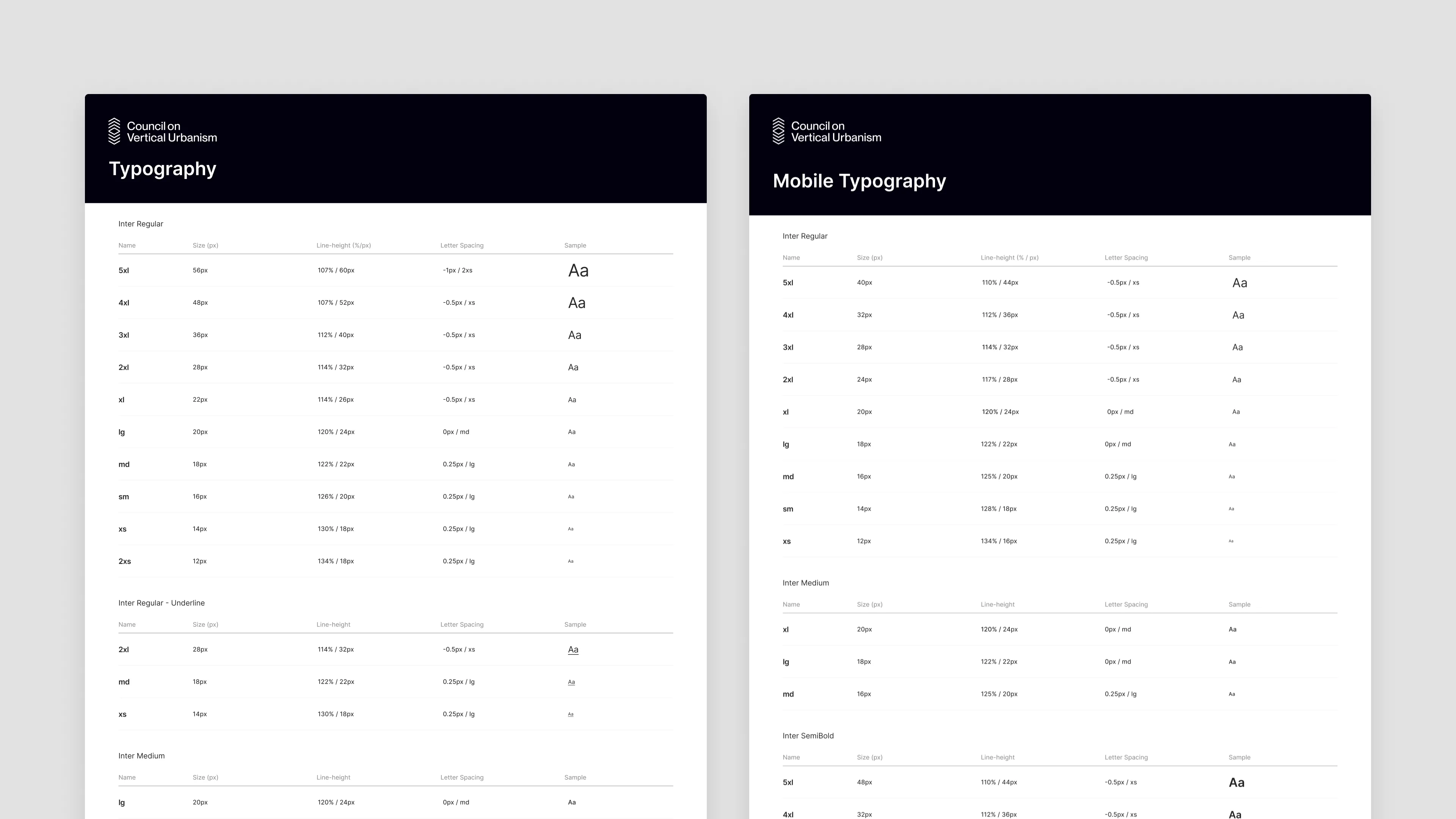
CVU was one brand on one site, so a token for every property would have added upkeep without a payoff. We built a desktop and a mobile scale and used t-shirt sizing (see the Reflection section to see why I would do this differently in the future).
Prioritizing accessibility
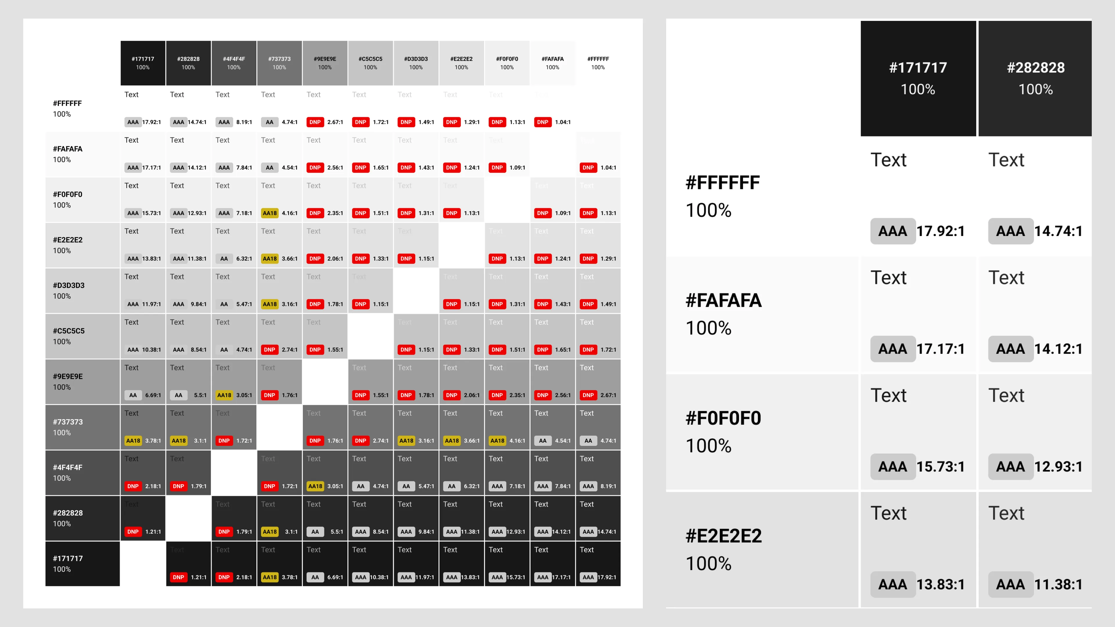
Accessibility was built into the tokens, not checked at the end. I tested every text and background pairing against WCAG AA contrast and documented the results in a table, so designers and developers could see which combinations were safe to use.
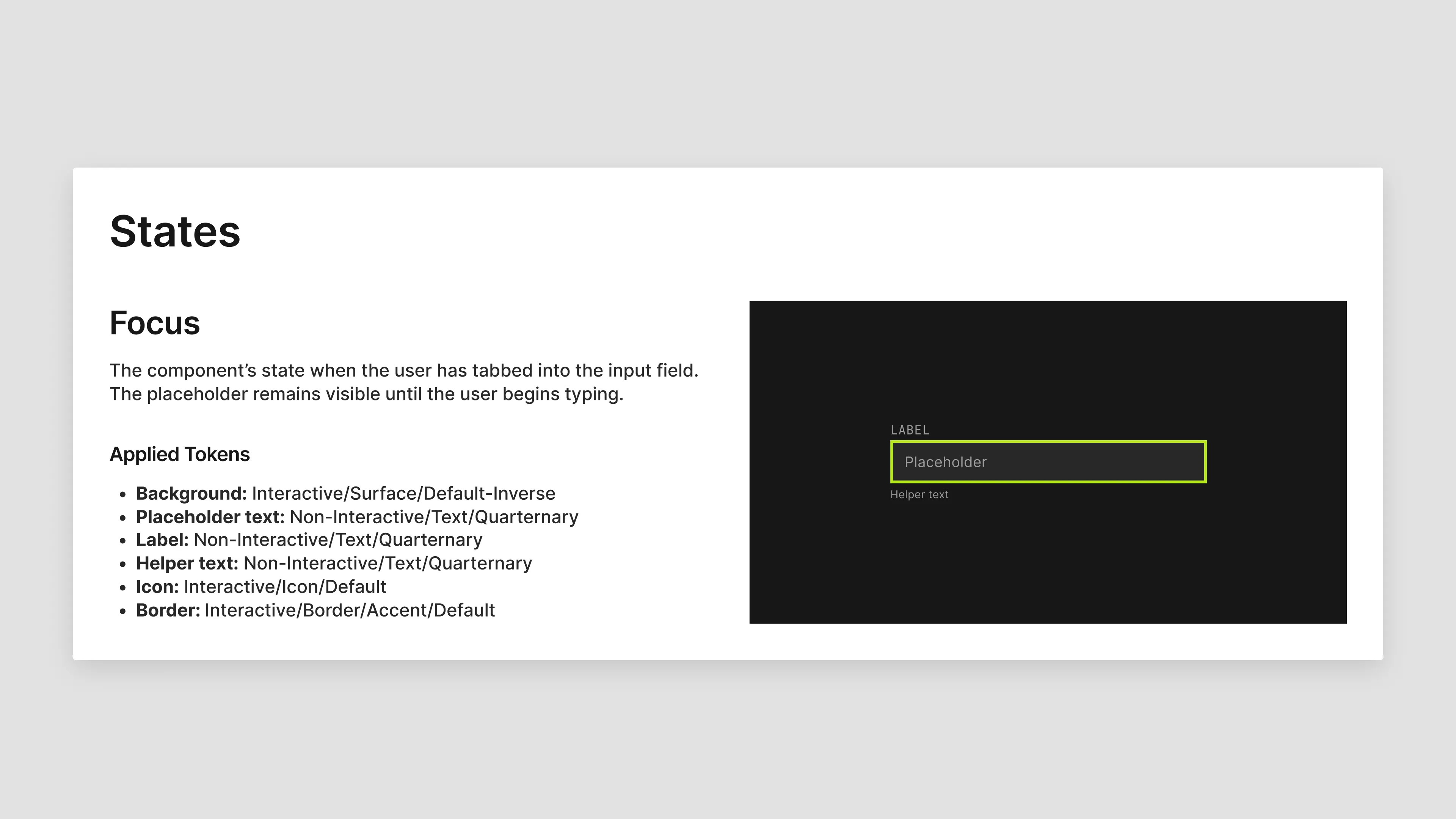
I designed custom focus states for a couple components like buttons and input fields, but we shipped everything else with native browser focus, which users already recognize.
Governance was the biggest gap.
Change management
We spent the majority of the project building the system and had no change management process for it, so it was easy for ad-hoc requests and rogue edits to find their way in. To mitigate this, I worked with developers during QA to make sure things were being built to spec.
Next time, I'd lock down the file, publish it to the workspace from the start, and work with the team to set up a governance model with a process for requesting changes.
Token structure
Inverse tokens were a deliberate decision, but I'd remove them and use modes instead. If I had to go back and do something differently, I'd assign theme and text color based on the background instead. I carried through this lesson when I built a light & dark mode system on Multiple Inc.'s company site redesign.
I'd use modes for typography too. We built the desktop and mobile scales as two separate sets of text styles, so nearly every style exists twice. Binding each style's size to a variable with a desktop and a mobile mode would have covered both breakpoints with one set.